At the present time HDR is most often associated with UHD, or Ultra High Definition (all too often incorrectly referred to as 4K which is a Cinema-only format). It’s important for us to mention that while much if not all HDR material available today is UHD resolution (3840 x 2160), the two are not intrinsically bound together. Whether Dolby Vision or HDR10, either is equally applicable to good old 1080p (1920 x 1080). In fact, many people in the biz right now may be heard musing that they would rather have HDR 1080p than SDR UHD and I am inclined to adopt that policy myself. Of course panel makers have been focusing on UHD resolution for so long now that it’s inevitable, but the point here is that it is HDR which everyone is really excited about.
Consider the following gamut chart. Don’t worry if you’ve never seen one of these before, I’ll explain.
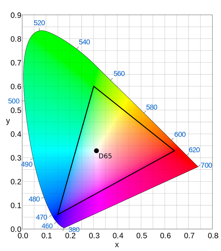 BT.709: Doesn’t quite push the limits of human vision. Image from Wikipedia.
The rounded sail looking portion with all the color in it represents the extent of human vision. We can see all those colors. The triangle within that? Oh, that’s the extent of how much color our HDTV system is capable of reproducing, formally known as BT.709 color space. Humbling isn’t it? And it’s not a whole lot better than the NTSC gamut which came before it. Here again these extents were largely based on technology limitations. While we can now make TVs which go beyond BT.709, we dare not ask them to alter the color of an HD signal because the content, similar to peak light output, has been crafted to this specific color standard, limited as it may seem. Trying to “stretch” content to a wider color gamut is, quite literally, not pretty.
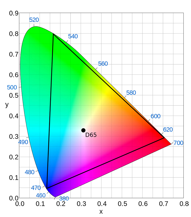
The good news is that Dolby Vision and HDR10, as well as SDR UHD for that matter, all come with a veritable crap load more color. The first time you see UHD or HDR it may well be the color that hits you, not UHD’s resolution or HDR’s brightness. In this next gamut chart you can see at a glance how much more of the human vision this new color envelope covers.
This is sweet, sweet news, even though there isn’t a consumer TV in the world which can come close to reproducing that color space. The foundation has been laid!
There is a wrinkle though, and so much misinformation circulating it makes your head spin. Two key points:
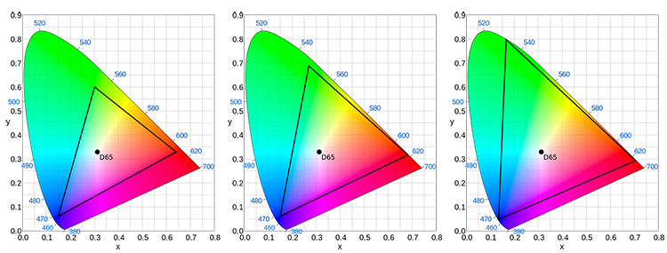
The first is that a lot of material which we are currently watching as UHD and HDR is being graded on gear which employs a color gamut that has absolutely nothing to do with BT.2020. Most titles are artistically assembled within a color space called DCI-P3 (aka “P3”). This is actually one of several color gamuts of Digital Cinema which is why grading suites setup to this standard are prevalent and why it is used on (almost) everything worth watching: the cinema still comes first folks! P3 happens to fall between the old 709 gamut and our new 2020 gamut, which is ok because that means when the material is encoded for UHD or HDR delivery, be it UHD Blu-ray, streaming, or other, it comes to us as BT.2020 and all is well. Even though the gamut of the UHD/HDR signal is wider than P3, the actual color itself is always identical in value to what the artist saw on their workstation! Phrased another way, though the UHD disc or stream is encoded with BT.2020, the color values map such that you see the same “physical colors” as was seen on the HDR Grading Monitor. When encoded as BT.2020 for home delivery there is no “stretching” of the color space taking place or any such nonsense. The worse you can say is that the title in question doesn’t fully exploit the available color volume.
I’ll again use audio as an analogy here.
Chances are good that anyone reading this will already understand how humans are quoted as being able to hear frequencies from 20 Hz (the lowest of the lowest rumble) to 20 kHz (the highest pitched whistle you can imagine). And so it goes that all our audio gear and standards are built around reproducing this full range. What happens if someone hypothetically mixes an album and their workstation is limited to, say, 16 kHz at the top end? What happens when that material gets put on CD? Nothing whatsoever! Sounds which were 16 kHz when mixed remain 16 kHz…even though the CD could contain sounds as high as 20 kHz.
If you port this example over to color space, a couple of things should resolve themselves in your mind fairly intuitively.
One is that if someone is grading a movie and is limited, either by equipment or choice, to a color space which falls inside BT.2020, the content itself is not intrinsically altered when delivered to the consumer in a BT.2020 gamut signal.
Many individuals confuse absolute color coordinates with digital signal code values. If you look at the CIE chart you can see that on the surface it is a basic 2-axis X, Y plot. This is oversimplifying, but you can think of any given color in the world as having a specific x, y value. What’s confusing is that the digital RGB values which represent that color will be different for each of the different color spaces. Let’s take a hypothetical color, I’ll call it “Soylent Green”, with a CIE reference of x: .2650 y: .6900. In DCI-P3 color space the code values to represent it are 16, 235, 16. What happens if we switch our working space to BT.2020? The CIE value of Soylent Green does not change! It remains x: .2650 y: .6900. The RGB values representing it do change however. Now Soylent Green is represented by RGB code values 121, 228, 51. The color itself does not change, whether we encode as DCI-P3 for commercial theaters, or BT.2020 for consumer delivery. The code value changes, not the color itself.
The take away here is there is no need to calibrate consumer equipment to P3, and in fact, doing so may result in an aberrant image. An HDR or UHD display calibrated against BT.2020 and receiving a BT.2020 coded signal, will display the correct color, regardless of what color space was used during grading. P3 simply does not exist in the consumer space. Although HDMI org as well as CTA 861 are looking into adding P3, that would be an incomplete implementation as it would also need to be added to H.265. Subsequently an RGB to YCbCr matrix would need to be created, something which no existing piece of hardware would have (in other words all new hardware needed with no backwards compatibility).
BOTTOM LINE: There is no P3 in UHD, Dolby Vision, or HDR10.

P3 is not the color space you are looking for… move along…. Image Copyright Lucas Film.
The other half of this P3 nonsense comes in the form of marketing misdirection <sigh>. As we said, today’s UHD and HDR displays can’t touch BT.2020 (yet), but they come close to P3 so marketing departments have been quick to latch on and add to the infernal misinformation fire. Saying that a TV can do 95% of something sounds better than saying it can do only 50% of something else. And so it goes that today’s TVs are marketed as having color reproduction close to P3 (which sounds better than admitting they are still a ways off from 2020). Oh I suppose given that a lot of today’s material is mastered to P3 it might be interesting to know if a given display’s rendition of BT.2020 covers as much, but really folks we need to press on to the prize…which is full BT.2020.
End of the P3 story (I hope).
The other thing about this new expanded color gamut which might dawn on you is that, conversely, if someone grades a movie and really, really pushes the limits of BT.2020, and you play it on one of today’s TVs, you won’t actually see the extreme values because they are beyond the capability of the display device. Don’t worry, Dolby Vision has an answer for that: in addition to dynamically and intelligently mapping the luminance of the movie to the absolute brightness capabilities of the display, so too is the gamut mapped. What about HDR10 you ask? Again that’s a bit of a wild west. Might get remapped, might get clipped. Do you feel lucky? No? Then stick with Dolby Vision.
Something which the good ol’ CIE chart doesn’t express: color brightness. In SDR and BT.709 only pure white can actually be 100% of peak brightness. In other words, only pure white can be as bright as 100 nits. If you isolate a color, say fully saturated blue; it cannot even come close to being that bright (all of about 8 nits in fact). With BT.2020 on the other hand, not only is there more color, but more color brightness! Layer HDR on top of that and we can finally have some seriously bright skies, glares, whatever, which are colorful and not the anemic white we’ve been used to for decades.
As an example, in the world of SDR, fully saturated blue can be all of… 8 nits. Any brighter than that and you move to white. On a 1000 nit HDR display pure blue can be 80 nits! Some of you might be underwhelmed thinking that’s still not as bright as peak white in SDR. Firstly, 80 nits is TEN TIMES brighter than the bluest blue of SDR. Second, as we said already, the average picture level with HDR will not be higher than SDR (irresponsible demo clips notwithstanding), yet within that APL, color itself can be so much brighter than before. As we’ve said already it may well be the color of HDR which hits you, not the peak brightness, and the increase in that color’s brightness is key.
Part 4: High Dynamic Range (HDR): SDR Calibration
Part 5: High Dynamic Range (HDR): HDR Calibration
Part 6: High Dynamic Range (HDR): Current issues
Part 1: High Dynamic Range (HDR): Fundamental Concepts of Dynamic Range


