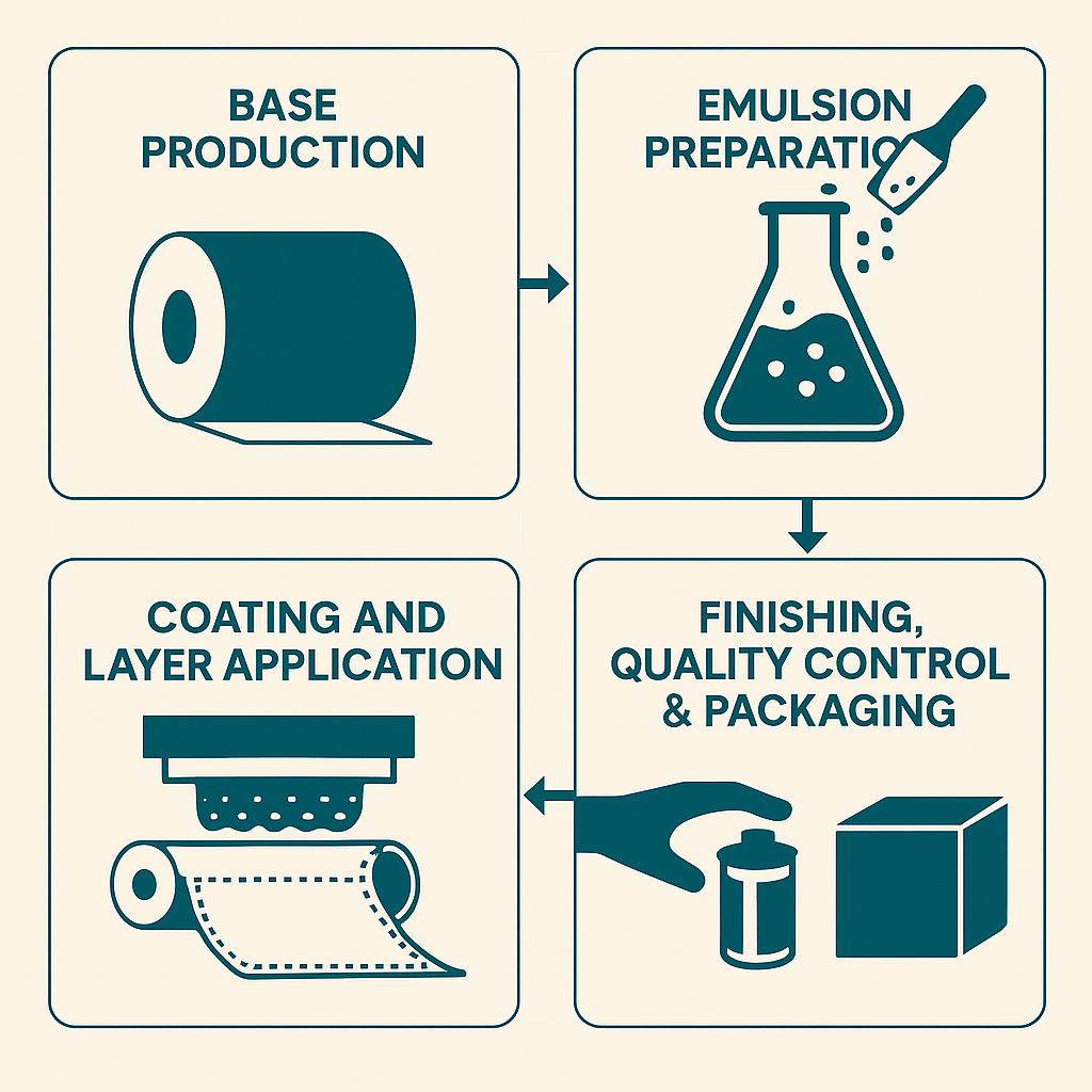
The manufacture of photographic film is one of the most precise and delicate industrial processes ever developed, a fusion of chemistry, physics, and engineering carried out in near-total darkness. Whether black-and-white or color, film production begins with a clear, flexible base, typically cellulose triacetate or polyester, onto which microscopically thin layers of light-sensitive silver halide crystals are coated. These crystals, suspended in a gelatin emulsion, must be spread evenly to molecular tolerances across hundreds or even thousands of feet of film. Any speck of dust, stray fiber, or microbubble could ruin an entire batch, causing image defects or fogging. For this reason, the coating rooms where film is made are among the cleanest manufacturing environments in existence, more sterile than operating rooms, with air filtration systems removing even microscopic contaminants.
In color film, the challenge is multiplied: three separate emulsion layers, each sensitive to a different primary color of light (red, green, and blue), must be precisely aligned and uniformly coated to ensure accurate color reproduction. The coating machinery, operating in total darkness or under controlled safelight conditions, applies these layers with astonishing precision, sometimes at speeds exceeding 300 feet per minute. After coating, the film undergoes careful drying, chemical hardening, and slicing into rolls, all within light-tight, dust-free conditions. From start to finish, every stage of production demands meticulous control of temperature, humidity, and timing. The result is a seemingly simple strip of film, yet behind it lies one of the most complex, light-sensitive, and precisely engineered products ever made.
1. Base Materials: The Foundation of the Film
The transparent base supports all photographic layers. Historically, this was cellulose nitrate, later replaced by cellulose triacetate in the mid-20th century for safety and stability. Today, polyester (polyethylene terephthalate, PET) dominates because it offers:
● Dimensional stability under humidity and temperature changes,
● Chemical inertness, and
● Archival longevity exceeding 500 years under proper
The base is produced by extrusion and biaxial stretching, aligning polymer chains to achieve uniform optical clarity. Finished base thicknesses range from 100 to 180 µm, depending on format. The surface is then sub-coated to promote adhesion of the gelatin emulsion. Even minute imperfections, surface waviness over 0.05 µm, or microscopic dust, would later cause optical distortion or blemishes in the image.
2. Emulsion Science: The Photographic Heart
The light-sensitive layers consist of silver halide crystals (AgBr, AgCl, or AgI) suspended in a purified gelatin binder. Emulsion formation begins with a double-jet precipitation process:

where controlled streams of silver nitrate and halide salts meet within a warm gelatin solution (≈ 40 °C).
By precisely controlling ion concentration, temperature, and flow rate, manufacturers regulate the size and morphology of the silver-halide grains. The average crystal diameter (d) directly influences film speed and graininess. Since light-sensitivity approximately scales as d2, a film with 1.0 µm grains is roughly four times faster than one with 0.5 µm grains, but with a visibly coarser texture.
Typical statistics:
| Film Type | Avg. Grain Diameter (µm) | Relative Speed (ISO) | Crystals per cm² |
| Fine-grain B&W | 0.1 | 25–100 | 10¹⁵ |
| General-purpose | 0.4 | 200–400 | 10¹⁴ |
| High-speed Color | 1.5–2.0 | 800–1600 | 10¹³ |
Sensitizing dyes are added to make the crystals responsive to green and red light; otherwise, they are only blue-sensitive. Gelatin provides elasticity and porosity, allowing developers and fixers to penetrate during processing.
3. Layer Engineering and Coating
In the coating stage, the film base moves through the coating alley, a tunnel-like chamber hundreds of feet long, maintained at ISO Class 1 cleanroom standards. A slide-hopper or curtain coater simultaneously applies multiple liquid layers in total darkness.
2. Yellow filter layer (prevents blue light from reaching deeper layers)
3. Green-sensitive layer with a magenta dye coupler
4. Red-sensitive layer with a cyan dye coupler
5. Interlayers to prevent chemical crosstalk
6. UV-absorbing and anti-halation back coatings
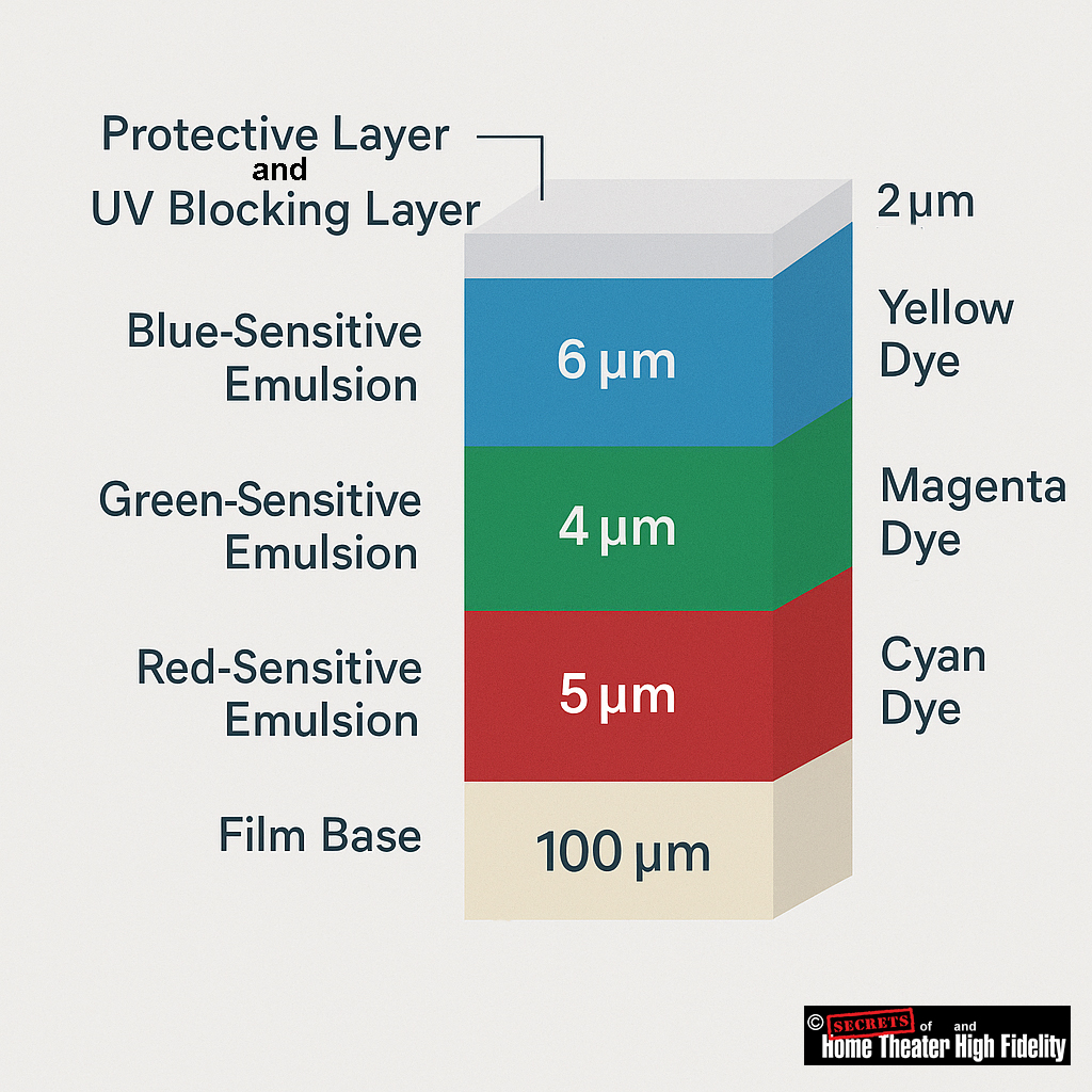
Each light-sensitive layer is 4 – 10 µm thick, resulting in a total coated thickness of roughly 50 – 70 µm. Uniformity across a 1.5-meter-wide roll is held within ±0.1 µm, a variation of less than 0.0001%. After coating, the film is gently dried in filtered warm air and hardened to stabilize the gelatin.
In the Negative Film (Camera Stock)
The light-sensitive layers correspond to the primary colors of light:
● Green-sensitive layer
● Red-sensitive layer
When light exposes these layers, each records the amount of its corresponding color in the scene.
During development, each layer forms a dye of the complementary color (the subtractive color).
That means:
| Light-Sensitive Layer | Records | Develops Into Dye | Dye Color Function |
| Blue-sensitive | Blue light | Yellow dye | Absorbs blue light |
| Green-sensitive | Green light | Magenta dye | Absorbs green light |
| Red-sensitive | Red light | Cyan dye | Absorbs red light |
So, blue is replaced by yellow dye, not cyan or magenta. Each dye formed, blocks the complementary color of light, which is how the negative image encodes scene colors accurately.
In the Print (Positive / Projection Film)
When this negative image is printed onto color print film, the process inverts the densities:
● Areas with magenta dye (blocking green) print as more green.
● Areas with cyan dye (blocking red) print as more red.
1. Protective Layer
● Composition: Usually a thin layer of hardened gelatin (around 1–2 µm thick) treated with hardeners and lubricants.
● Optical Function: It’s essentially transparent and does not intentionally alter the film’s spectral sensitivity.
● Analogy: Think of it like the clear coat on a car, purely mechanical protection.
2. UV-Blocking Layer
● Composition: A gelatin layer containing UV-absorbing dyes or molecules (often benzotriazoles or similar organic absorbers).
● Thickness: Around 1 µm or less, optically active but very thin.
● Optical Function: Absorbs light below roughly 400 nm to prevent unwanted UV exposure that could degrade image sharpness or cause color shifts.
3. Relationship Between Them
In some film designs, the UV-blocking agents are incorporated directly into the protective layer, forming a single multifunctional topcoat. In others, especially older or high-end professional films, they are distinct layers, each optimized separately: the protective for toughness, the UV-blocking for spectral control.
Summary:
● The UV-blocking layer = optical filter.
● They may be combined in a single coating, but they serve different purposes and are formulated differently.
4. Precision and Mathematics of Film Microstructure
A single 35 mm film frame (24 × 36 mm) contains on the order of 10⁸ to 10⁹ individual grains, each functioning as a quantum photodetector. The exposed fraction ƒ of grains can be modeled as:

where E is exposure (lux·seconds) and ka constant reflecting emulsion sensitivity. The resulting image density after development obeys:

with γ representing the film’s contrast gradient (≈ 0.6 for negatives, 1.5 for slide films).
Such relationships define the Hurter-Driffield (H-D) curve, fundamental to sensitometry and to calibrating manufacturing batches so that every roll exhibits consistent tonal response.
5. Development Chemistry: Black & White vs. Color
Black & White Film
When exposed to light, silver-halide crystals form latent metallic-silver specks at their sensitivity sites. During development (e.g., with metol-hydroquinone or phenidone developers), these sites catalyze the reduction of the entire crystal to metallic silver:

Unexposed grains remain unreduced and are later dissolved in the fixer (usually sodium thiosulfate). The remaining silver forms a negative image whose density is proportional to the light exposure.
History of Orthochromatic and Panchromatic Film
The transition from orthochromatic to panchromatic film occurred over decades, driven by chemical and technical improvements that offered more accurate tonal reproduction in black-and-white photography. Panchromatic film, which captured the full visible spectrum, eventually replaced orthochromatic film, which was insensitive to red light.
Orthochromatic film (1880s–1920s)
● Improved sensitivity: German chemist Hermann Wilhelm Vogel’s research in 1873 led to the use of sensitizing dyes, which created orthochromatic film that was sensitive to green as well as blue light. Commercial orthochromatic dry plates became available in the 1880s.
● Visual limitations: Because the film did not register red light, skies would often appear blown out or overexposed, while red objects, like lips or rosy cheeks, would appear dark or black. This created a moody, high contrast look that became a defining characteristic of early cinema and photography.
● Convenient darkroom use: A key advantage of orthochromatic film was that it could be processed under a red safelight, since it was not sensitive to that portion of the spectrum. When I was in middle school (8th grade in the 1950s), I decided that I wanted to develop and print my own camera film. I went to a Goodwill Store and found a Kodak book on processing film. It was written in the early 1940s. It said that I could use a red safelight while developing it. Unfortunately, the book was written for orthochromatic film, and I was processing panchromatic film, so my first roll developed completely black. The red safelight was fine for photographic paper developing, though. Later on, I found I could also use a yellow-orange safelight for paper, and that made a huge difference in my ability to see in the darkroom.
Panchromatic film (1900s–1950s)
● More natural tones: By capturing the full visible spectrum, panchromatic film provided a more accurate and realistic grayscale rendering of colors as the human eye perceives them, with a wider range of gray shades.
● Hollywood adoption:
- Slow start: Early panchromatic film was slower and more expensive than orthochromatic film, causing it to be used sparingly for special outdoor scenes or until costs came down.
- Cost parity: By 1926, Eastman Kodak dropped the price of its panchromatic film to be competitive with orthochromatic film, leading to rapid adoption in the film industry.
- Silent film sound: The introduction of sound in films after 1927 also accelerated the switch. The arc lamps used for lighting in the orthochromatic era were too noisy for sound recording, so studios switched to quieter, full-spectrum incandescent lighting that worked better
with panchromatic film.
● Widespread adoption: By the 1950s, panchromatic film had largely replaced orthochromatic film in the amateur photography market.
The evolution from orthochromatic to panchromatic film represents a significant advance in photographic technology. While orthochromatic film offered certain darkroom conveniences, the ability of panchromatic film to render a more natural and accurate range of tones made it the new industry standard for black-and-white photography and filmmaking.
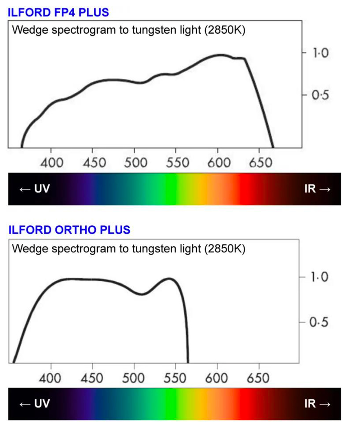
Here is a chart showing the difference in color sensitivity between Ilford’s FP4 panchromatic film and their Ortho Plus orthochromatic film:
The X axis is in nanometers (nm), and the Y axis is relative sensitivity. (Image © Ilford)
Color Film
Color processing (e.g., C-41 for negatives, E-6 for slide film) is far more complex. Each layer contains a dye coupler that reacts with the oxidized developer to produce a dye image:
● Red-sensitive layer → Cyan dye
● Green-sensitive layer → Magenta dye
● Blue-sensitive layer → Yellow dye
After color development, metallic silver is removed in a bleach-fix (blix) stage, leaving only the dyes. Temperature control within ±0.15 °C at 37.8 °C is mandatory; even a slight variation can shift color balance or contrast. Color film development thus reproduces the three primary-color records as dye images that combine to yield a full-color negative or transparency.
6. Finishing and Quality Control
Once dried and stabilized, the wide coated rolls are slit and perforated to camera format dimensions. Continuous optical and electronic inspection systems detect defects smaller than 1 µm, using laser scatter and infrared transmission. Rolls that pass inspection are spooled into cartridges under safelight conditions and sealed in moisture-barrier packaging filled with inert nitrogen.
Quality-control labs test each batch for ISO speed, contrast, fog level, and color balance. Even after packaging, sample rolls are stored in controlled cold vaults for accelerated-aging tests to verify long-term stability.
Secrets Sponsor
Here is a summary of the color negative film (from the camera) and color positive film (the projection print):
Color Negative Film (Camera Film)
The color negative film has three light-sensitive emulsion layers, each sensitized to one primary color:
● Top layer: Blue-sensitive
● Middle layer: Green-sensitive (with a yellow filter above it to block blue light)
● Bottom layer: Red-sensitive
When light hits the film during exposure, it creates a latent image in each layer corresponding to how much blue, green, or red light was present in each part of the scene.
During development, something counterintuitive happens: each layer produces the complementary color dye:
● Blue-sensitive layer → Yellow dye (which blocks blue)
● Green-sensitive layer → Magenta dye (which blocks green)
● Red-sensitive layer → Cyan dye (which blocks red)
Additionally, the amount of dye is inversely proportional to the exposure. For example, a bright red object in the scene creates a lot of exposure in the red-sensitive layer, which produces little cyan dye in that area of the negative.
The Printing Process (Creating the Positive)
When printing the negative onto positive print film, white light passes through the negative. The negative’s dyes act as filters:
● Where there’s cyan in the negative, it blocks red light
● Where there’s magenta in the negative, it blocks green light
● Where there’s yellow in the negative, it blocks blue light
The print film also has three RGB-sensitive layers that produce CMY dyes. But here’s the key: the negative has already inverted everything once, so this second inversion brings us back to the original colors.
The correct way to think about it is that the print positive works by subtractive color. Each dye subtracts its complementary color from the white projection light:
● Cyan dye subtracts red
● Magenta dye subtracts green
● Yellow dye subtracts blue
So, for a red object in the original scene:
● The negative has high magenta and yellow density (blocking green and blue in the printer).
● Only the red light reaches the print film during printing.
● This creates minimal cyan, high magenta, and high yellow in the print.
● When projected, the magenta and yellow dyes block green and blue, letting only red through.
● We see red!
This double-negative process might seem overly complex, but it was essential for practical filmmaking because it allowed multiple positive prints to be made from a single camera negative, and the color relationships work out correctly through the subtractive color process.
Why did color film evolve around secondary (subtractive) colors, cyan, magenta, and yellow, rather than the additive primaries of red, green, and blue?
1. Additive vs. Subtractive Color Systems
● Additive color (RGB) applies when light is emitted, as in projectors, digital sensors, or displays. Combining red, green, and blue light makes white; overlapping them physically yields black, because there is no transmitted light.
● Subtractive color (CMY) applies when light is filtered or absorbed, as in dyes, pigments, or photographic film. Here, color arises by subtracting portions of the spectrum from white light passing through the material.
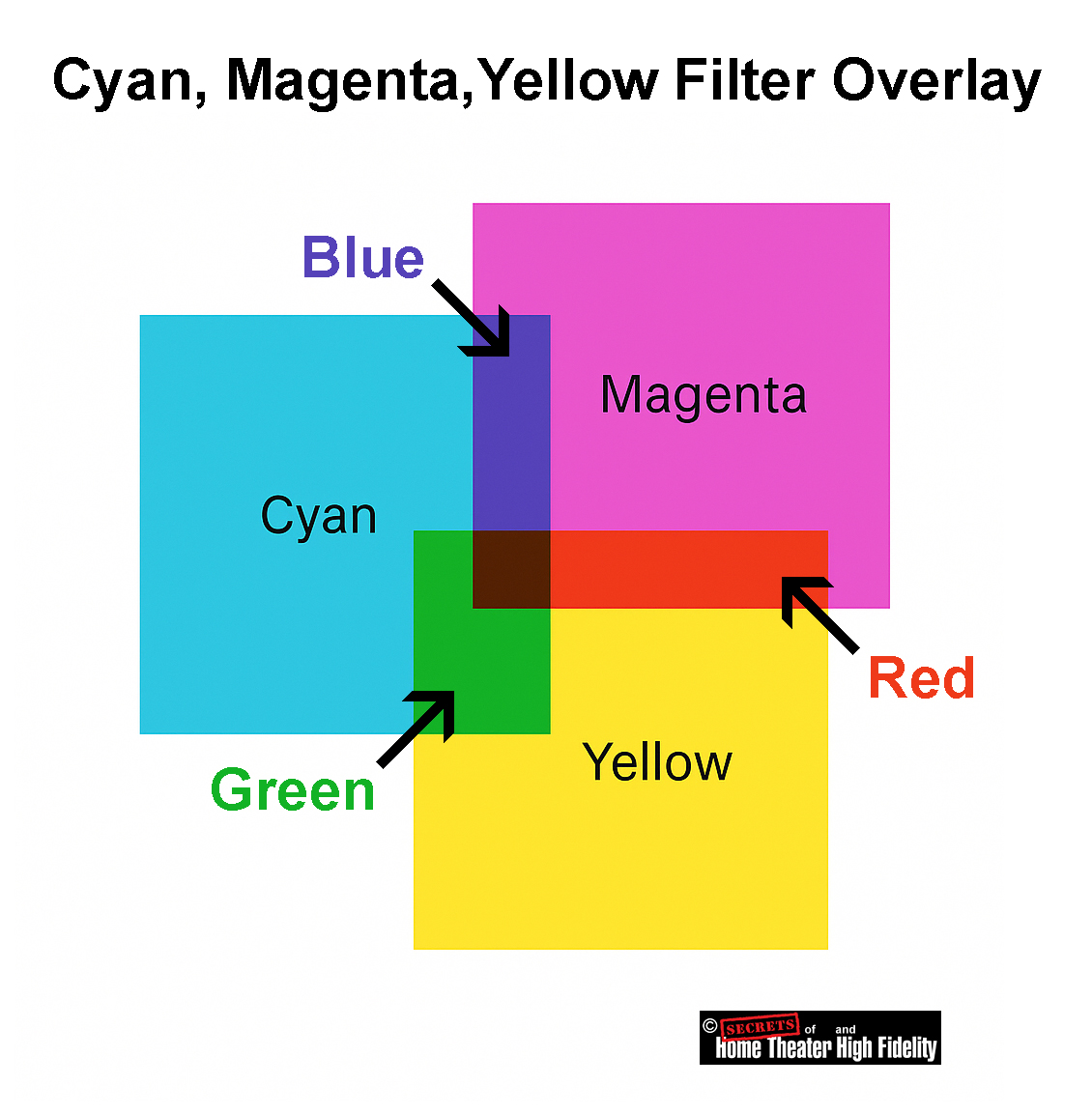
When you stack cyan, magenta, and yellow filters (each dye absorbing its complementary primary color):
● Cyan absorbs red.
● Magenta absorbs green.
● Yellow absorbs blue.
By varying their densities, you can reproduce any hue, including red (magenta + yellow), green (cyan + yellow), and blue (cyan + magenta), as well as white (no dyes) and black (all dyes dense).
2. Why Film Uses the Subtractive (CMY) Model
Color film’s image is formed by transparent dyes, not by light emission. Each layer of the film acts as a filter, transmitting or blocking specific wavelengths of light. If film had been built on RGB dyes, overlapping them would block most light, producing murky blacks instead of bright color combinations. But with CMY dyes, overlapping filters transmit mixtures of light, faithfully reproducing the full spectrum when projected.
So, when white projector light shines through a developed color negative or positive:
● The magenta dye controls green light,
● The cyan dye controls red light, and the combined transmission recreates the scene’s original colors through subtractive mixing.
3. Chemical and Practical Reasons
The chemistry of film reinforced this logic. In development, each silver-halide layer (sensitive to blue, green, or red) forms its complementary dye:
● Green-sensitive layer → Magenta dye
● Red-sensitive layer → Cyan dye
These dyes are subtractive filters, perfectly matched to how film is projected, with white light shining through the developed image.
Summary
Color film evolved using secondary (subtractive) colors because, for transmitted light, CMY dyes allow all six fundamental colors (RGB and CMY) to be formed by overlapping transparent layers. If RGB were used, the overlaps would produce black (no transmission), not color.
Digital sensors record with RGB (additive) because they capture light. Film reproduces with CMY (subtractive) because it filters light.
That fundamental optical distinction, additive emission vs. subtractive transmission, is what made CMY chemistry the foundation of color film.
The diagram below shows how combinations of the three secondary colors can reproduce the three primary colors as well. For example, a combination of cyan and magenta results in blue.
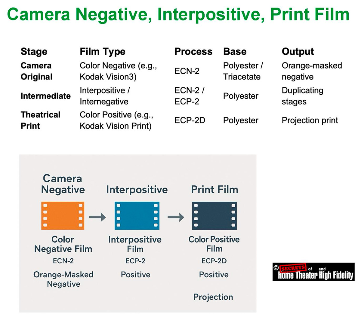
The type of color film used in making movies is known as color motion-picture film, and it comes in two main classes:
1. Camera (Negative) Film
This is the raw stock loaded into movie cameras during filming. It captures the original image in color negative form, much like color-negative still film (C-41), but engineered for motion-picture processing standards.
● Emulsion Structure: Multi-layer silver-halide emulsion on a polyester or triacetate base with rem-jet (anti-halation) backing.
● Base: Almost all modern camera stocks use polyester (PET) for strength and dimensional stability, though acetate may still be used for certain camera systems that require easy splicing or silent operation.
● Processing: Developed in ECN-2 chemistry, which includes a pre-bath to remove the rem-jet layer before development. The process runs at 41.1 °C (106 °F) and yields a color negative with an orange mask, similar in concept to still-film negatives.
Key examples:
● Kodak Vision3 250D (5207) medium speed
● Kodak Vision3 500T (5219) tungsten balanced, high sensitivity
● Orwo Color NC500/NC400 modern European color-negative stocks
These are the films cinematographers use in 16 mm, 35 mm, and 65 mm cameras.
2. Print (Positive / Release) Film
After editing and color grading, the negative is contact-printed or digitally recorded onto color print film, producing the projection copy.
● Function: Converts the color negative to a positive image for theatrical projection.
● Base: Virtually all print films are polyester, since projection prints undergo mechanical stress in projectors and must not tear or shrink.
● Processing: ECP-2D chemistry, optimized for consistent density and color balance in mass duplication.
3. Special Intermediate Films
For analog postproduction steps between negative and print:
● Interpositive film (IP): Used for color timing (grading) and master storage. Both use variations of the ECN/ECP systems with slightly different gamma and contrast characteristics.
4. Historical Types
Before today’s ECN/ECP films, movie color was recorded on:
● Eastmancolor (1950 onward): Single-strip color negative film, the ancestor of all modern motion-picture stocks.
Modern movies are shot on Kodak Vision3 (ECN-2) color negative polyester film and printed, if projected on film, on Vision Color Print (ECP-2D) polyester film.
Every strip of photographic film represents the culmination of more than a century of scientific refinement, an exquisite interplay of chemistry, physics, and mechanical precision designed to capture light in its purest form. Within its thin, flexible base lies an astonishing structure: layers of silver-halide crystals and dye couplers arranged with sub-micron accuracy, each crystal poised to record the instant a photon alters its state. These invisible reactions, billions per frame, embody one of the most refined achievements of modern materials science.
Manufactured in absolute darkness and dust-free conditions, each roll of film is a triumph of engineering, balancing the unpredictability of chemistry with the repeatability of precision machinery. Even in an age ruled by digital sensors, film endures not as nostalgia but as a deliberate artistic choice. Many of today’s most acclaimed directors, Christopher Nolan, Quentin Tarantino, Greta Gerwig, and Paul Thomas Anderson, among them, continue to shoot on 35 mm, 65 mm, or IMAX film for its luminous texture, highlight roll-off, and organic color depth that digital imaging still strives to emulate.
Film offers more than resolution; it conveys atmosphere, emotion, and authenticity through the subtle imperfections of a living emulsion. Its cost and complexity only heighten its value as a craft, demanding intention and discipline on set. Every foot of film stands as a testament to human ingenuity, a physical medium that transforms fleeting light into enduring art, proving that even in a digital world, the analog image remains profoundly alive.
Secrets Sponsor
NOTES
Here are the most recent publicly available statistics on the share of movies shot on film vs. digital:
● Another dataset looking at the U.S. top 100 grossing films between 2006-2017 found in 2017 that about 92% were shot digitally, with only about 8% shot on film or film & digital. The Pudding+1
● For worldwide film production (not just U.S. top-grossing), the proportions are less clearly documented, but the consensus is that digital capture dominates globally, with film making up a small minority (single‐digit to low-teens percentage for major releases).
So, to sum:
● Worldwide: Also, strongly digital-dominant, though the exact % for film is less precisely documented.
Almost all movies shot on film today are released digitally, even those that were photographed entirely on 35 mm or 65 mm film. Film is used primarily as a capture medium, while digital projection (DCP format) has become the universal distribution and exhibition standard.
1. The Shooting Stage
Many acclaimed directors still prefer to shoot on film for its dynamic range, texture, and highlight roll-off, for example:
But immediately after shooting, the film is scanned at 4K – 8K resolution into digital intermediate (DI) format for color grading, editing, and visual effects.
2. The Post-Production Stage
The Digital Intermediate (DI) process converts the film negative into high-bit-depth digital files (often 16-bit DPX or EXR). This allows all editing, grading, and VFX to be done digitally. Only in rare “all-analog” projects (like The Hateful Eight in 70 mm) is the film edited and finished photochemically.
3. The Distribution Stage
By 2025, over 98% of theaters worldwide will use digital projection systems (DCP: Digital Cinema Package). These use servers and encrypted 2K/4K projectors rather than physical reels. A few major directors, Nolan, Tarantino, and Spielberg, sometimes request 35 mm or 70 mm film prints for prestige or special screenings, but this accounts for well under 2% of total theatrical prints globally.
4. The Release Formats
| Format | How It’s Captured | How It’s Released | Notes |
| 35 mm Film | Photochemical | Mostly DCP (digital) | Film prints are extremely rare |
| 65 mm / IMAX Film | Photochemical | Both DCP and limited 70 mm | Nolan & IMAX premieres |
| Digital (Arri Alexa, RED, Sony Venice, etc.) | Digital | DCP | Dominant workflow |
5. Summary
● Nearly all theaters project digitally, so even film-origin movies are digitally scanned and released as DCPs.
● A tiny handful of prestige films (e.g., Oppenheimer, Once Upon a Time in Hollywood, The Master) are also printed to 70 mm or 35 mm film for limited release, usually a few hundred prints worldwide.
Much of the film “look” survives the digital transfer, but not all of it.
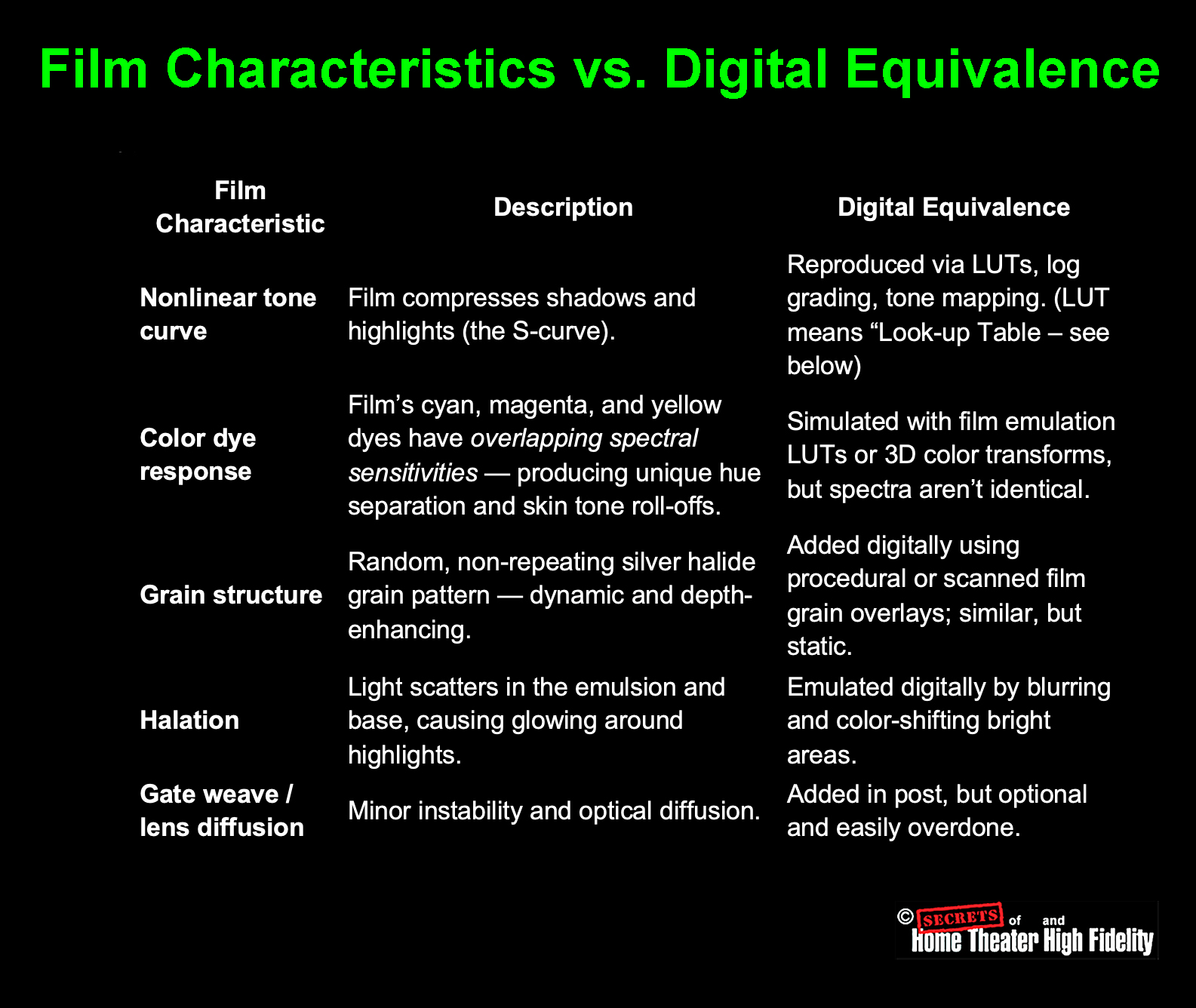
1. What Makes Film Look Different?
Film’s distinctive appearance arises from several intertwined physical factors:
● Highlight Roll-Off: Film compresses highlights gradually because of the nonlinear shoulder of its sensitometric curve; bright areas fade gracefully instead of clipping to pure white.
● Grain Structure: Randomly distributed silver halide crystals create organic texture, giving apparent depth and movement to the image.
● Color Response: Film’s dye layers have unique spectral sensitivities that separate hues differently than a Bayer-pattern sensor.
2. What Happens in the Digital Intermediate (DI)?
When the film is scanned on a high-end scanner (ARRISCAN, Lasergraphics, Northlight, etc.), it’s digitized at 4K – 8K, 16-bit per channel, far more than standard cinema projection uses. This process can retain nearly the full dynamic range and color density of the negative.
However:
● The highlight shoulder and gentle midtone contrast must be replicated via LUTs or tone-mapping; scanners capture the density curve, but grading must interpret it correctly.
● The color-dye response can be modeled accurately, but not perfectly, especially in saturated reds and deep blues, where film dyes exhibit complex spectral rolloffs.
In practice, skilled colorists use film emulation LUTs and ACES tone mapping to preserve these characteristics. Many post houses, such as Company 3 or FotoKem, maintain proprietary scanning and grading profiles tailored to each Kodak stock.
3. How Much Is Actually Retained?
| Film Characteristic | Retailed After DI? | Notes |
| Dynamic Range | Almost entirely | 13-14 stops captured in a 16-bit scan |
| Highlight Roll-Off | Partially | Must be tone-mapped carefully |
| Grain Texture | Partially | Present but static; can be enhanced digitally | Color Rendition | Mostly | Depends on scanner spectral accuracy | Depth & Organic Feel | Subjective | Often reduced, but recoverable with skill |
So, roughly 80-90% of the film’s character survives a high-quality digital scan and grade, enough that audiences can still feel it was shot on film, though cinematographers can tell the subtle difference.
4. Why Directors Still Choose Film
Directors like Christopher Nolan and Greta Gerwig shoot on film not only for the projection result, but for on-set discipline and texture, the way light interacts with emulsion, and how exposure latitude shapes artistic decisions. Even if the final distribution is digital, the starting medium influences the aesthetic deeply.
When properly scanned and graded, film retains most of its dynamic range, tone curve, and color depth in digital form. What’s mostly lost is the tactile, random, living quality of projected film grain and highlight bloom, subtle but perceptible to trained eyes.
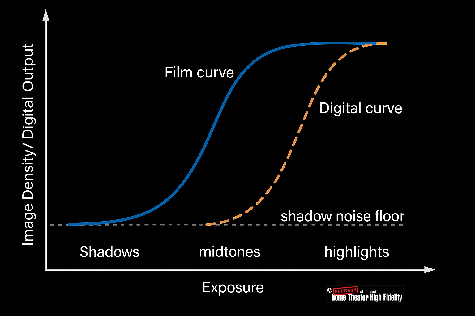
Here is a comparison of Film and Digital Sensor Response Curves:
● Digital: the sensor’s response is linear until it hits the physical noise floor at the bottom and the full-well limit at the top. Mid-tones and highlights reproduce cleanly and with high precision, but the very darkest stops sit close to the read-noise level, so tonal separation is reduced, and blacks can clip abruptly if exposure is pushed down. On the bright side, once it saturates, it clips hard.
Film gives a more even, forgiving tonal roll-off across the full range, while a raw linear digital sensor handles mid-tones and highlights very accurately but needs log encoding or grading tricks to bring its shadow behavior closer to what film does naturally.
1. Film: Smooth, Nonlinear, and Forgiving Response
● The toe region allows film to gradually pick up shadow detail; it doesn’t record deep blacks linearly, but the gentle slope gives a perceptual softness that makes shadows appear more natural and rich.
● The straight-line region (midtones) provides good contrast and tonal accuracy
● The shoulder compresses highlights, preventing overexposure from turning into hard white patches.
Result: Film renders a continuous, organic transition from shadows through highlights. Even though the response isn’t linear, the eye perceives it as natural and evenly balanced.
2. Digital Sensors: Linear Response with Sharp Limits
● That’s great for midtones and controlled lighting, where linear precision yields clean, noise-free color.
● But at the low end (shadows), signal levels approach the read noise floor, so small changes in light are lost in noise, and tonal separation suffers.
● At the high end, sensors have a hard saturation point; any light beyond that maximum voltage just clips to pure white.
Result: Digital can produce extremely detailed midtones and highlights, but often loses subtle gradations in shadows (unless lifted carefully in post using log or RAW encoding).
3. Side-by-Side Tonal Behavior
| Tonal Region | Film Response | Digital Response |
| Shadows | Gradual, lifted toe with soft grain | Prone to noise or abrupt black |
| Midtones | Natural contrast | Excellent linear accuracy |
| Highlights | Smooth shoulder roll-off | Hard clipping beyond full well |
Film offers a more uniform, perceptually balanced response across the entire tonal range, while digital excels in midtones and highlights but must work harder (via log encoding or noise reduction) to reproduce clean shadow detail.
Digital colorists can come very close to making a natively digital movie have that film look, often indistinguishably close for audiences, but not perfectly identical at a physical level.
Let’s go into detail as to why that is.
1. What “Film Look” Actually Means
The “film look” is not just a color palette — it’s the cumulative result of several physical and optical properties:
Film’s “look” is thus a combination of optical physics, chemistry, and randomness; digital can emulate each component, but not the same underlying process.
2. How Colorists Reproduce the Look
Modern colorists use highly refined tools to replicate the filmic response curve and color separation:
● Log encoding – Digital cameras shoot in “log” formats (e.g., ARRI LogC, REDLogFilm) that already mimic the dynamic compression of film.
● Color grading workflows – In DaVinci Resolve or Baselight, colorists apply S-curves, subtractive color models, and contrast roll-offs modeled after film print density curves.
● Grain overlays – Real scanned 35 mm/16 mm grain maps are composited dynamically to restore depth and texture.
A well-calibrated workflow can fool even trained eyes in many cases, especially when viewed as a finished movie in projection or streaming compression.
3. What Can’t Yet Be Perfectly Reproduced
● Micro-randomness of emulsion grain: Every frame of film has a new, unpredictable pattern of grain and scatter. Digital grain overlays loop or use pseudo-random maps, close, but not truly chaotic.
● Depth and highlight diffusion: Light physically scatters within the emulsion layers, which creates a glowing softness around highlights that digital systems simulate but can’t reproduce optically.
4. How Close Can They Get?
Extremely close, so close that most audiences (and many professionals) cannot tell without side-by-side comparison.
Cinematographers often say:
“You can make digital look like film, but you can’t make it behave like film.”
The behavior, how film responds on set to light, exposure, and overexposure influences how cinematographers light and frame a scene. That psychology of shooting film can’t be emulated after the fact.
Summary
| Aspect | Digital Can Match? |
| Tonal curve and contrast | Almost perfectly |
| Color palette and hue roll-off | Very close |
| Grain and texture | Convincing but synthetic | Highlight diffusion | Approximated | Underlying chemistry/response | Not reproducible |
So: A skilled colorist can emulate the visual appearance of film extremely accurately, enough to fool nearly any viewer, but not its physical behavior or organic randomness.
LUT stands for Look-Up Table, and in color science, it’s essentially a mathematical map that converts one set of color and brightness values into another.
1. What a LUT Does
Think of a LUT as a translator between how an image is recorded and how you want it to look.
● and outputs new values that change contrast, saturation, and color balance, instantly reshaping the visual style.
Formally, a LUT is a table that tells the system:
“When you see this input color value, replace it with this output color value.”
2. Why It Exists
Digital images are recorded in various color spaces and gamma curves (logarithmic, linear, Rec.709, etc.). These formats don’t look “right” to the eye until they’re translated into a viewing format.
A LUT can:
● Apply creative looks, such as the color palette of Kodak Vision3 film, teal–orange blockbuster style, or vintage monochrome.
● Match one camera’s color science to another (e.g., RED → ARRI).
3. Types of LUTs
| Type | Typical Use | Example |
| 1D LUT | Adjusts only luminance or tone curve (one dimension of data). | Converting a log curve to Rec.709 gamma. |
| 3D LUT | Adjusts hue, saturation, and brightness in full 3D color space. | Film emulation, color grading |
| Technical LUT | Standard conversion between color spaces or cameras. | ARRI LogC → Rec.709. | Creative LUT | Artistic stylization for mood or color tone. | “Kodak 2383” film print LUT. |
In professional color grading, 3D LUTs are most common; they map input RGB cube coordinates (like a 33 × 33 × 33 grid of colors) to new RGB outputs, transforming color relationships nonlinearly.
4. Example
Suppose your digital camera recorded a gray, low-contrast image in LogC mode (to preserve dynamic range). You apply a LogC-to-Rec.709 LUT, which:
● Corrects gamma.
● Recovers proper saturation.
● Converts color primaries to the display space.
Now the image looks normal and vibrant.
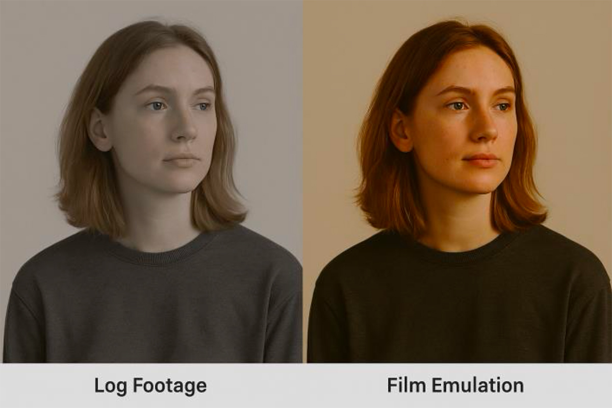
If you then apply a film emulation LUT, it adds:
● Warm shadows, gentle highlights.
● Subtractive color model similar to film dyes.
5. How LUTs Are Used
LUTs are loaded into:
● Cameras and monitors, for on-set viewing (so the director sees the intended look live).
● Editing workflows, to preview or bake in color correction.
Colorists often stack multiple LUTs:
2. Creative LUT – applies film look or color mood.
3. Output LUT – adjusts for final display format (HDR, SDR, etc.).
Summary
| Term | Meaning |
| LUT | Look-Up Table – a color transformation map. |
| Purpose | Converts or stylizes color and tone values. |
| Common Types | 1D LUT (gamma), 3D LUT (color look), Technical LUT, Creative LUT. | Used In | Cameras, monitors, post-production, and grading suites. |
In short:
A LUT is a mathematical color recipe that can instantly transform the way an image looks, from a flat digital log file into something that emulates the warmth, contrast, and tone of classic film.
Here is an example of a digital log footage shot and the application of a LUT to that footage. It does not just click on color saturation and hue and adjust them, but rather, it applies a complete range of preset color factors all at once.
Kodachrome, which is a positive transparency film, uses cyan, magenta, and yellow dyes – not red, green, and blue dyes.
Like all color transparency films, Kodachrome works by subtractive color, which requires CMY dyes:
● Magenta dye blocks green light
● Yellow dye blocks blue light
What made Kodachrome unique was not the colors of its dyes but how the dyes were formed:
● Kodachrome had NO dye couplers in the film – just black-and-white silver halide layers
● The CMY dyes were added during the incredibly complex K-14 development process, with each layer developed separately
This gave Kodachrome its legendary sharpness, color stability, and distinctive look. But the actual dyes were still the standard cyan, magenta, and yellow – they just got there through a completely different chemical process.
The confusion may come from Kodachrome being a positive (reversal) film that produces colors that look “right” when viewed directly, unlike negatives. But it still achieves those colors through CMY dye layers, not RGB.
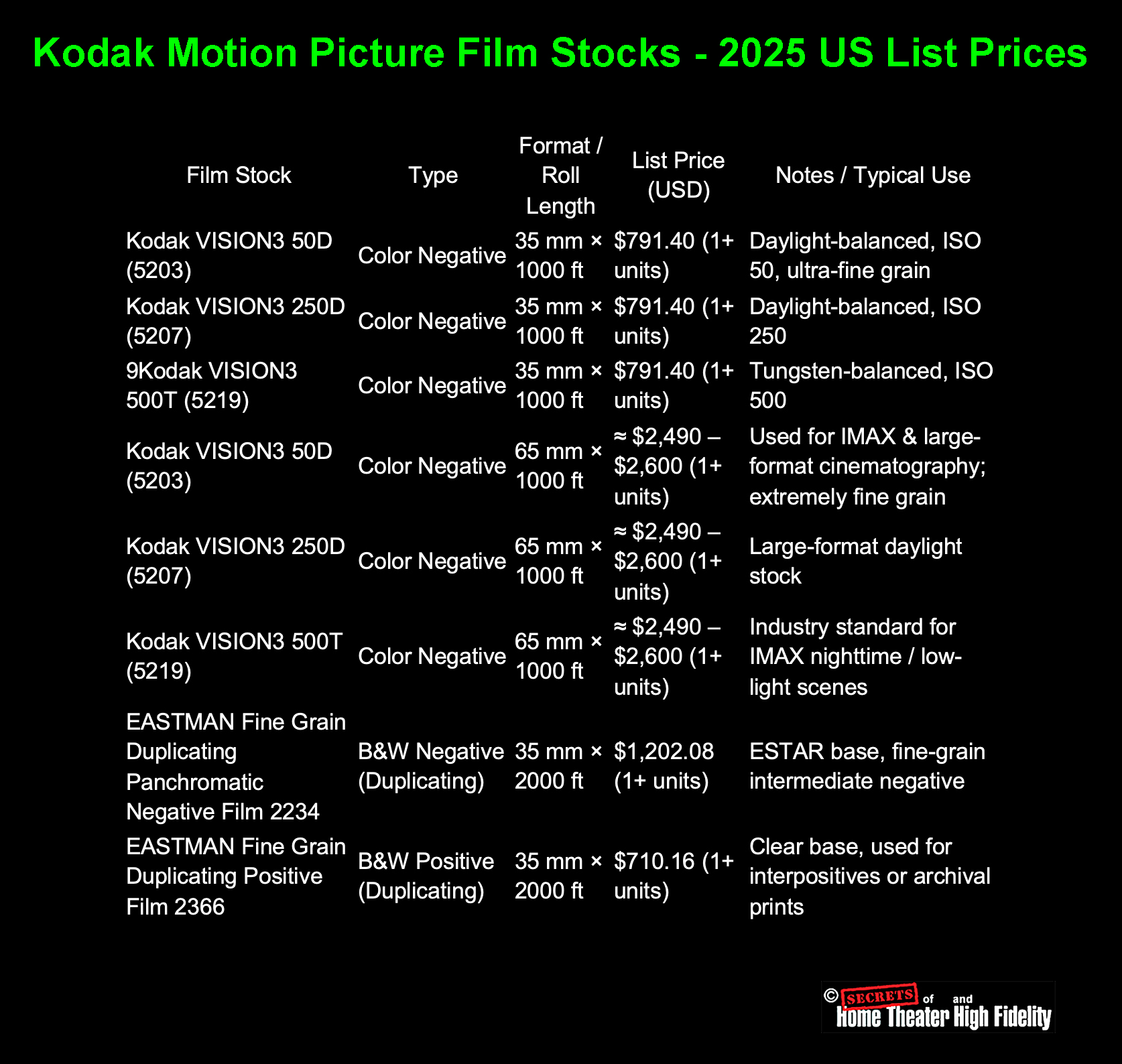
Here’s a complete film price table including the 65 mm versions of Kodak’s major color negative stocks (used for IMAX and large-format production) alongside the 35 mm and black-and-white entries. Prices reflect Kodak’s Motion Picture Products Price Catalog – US Edition (effective Feb 1, 2025) and current industry data for large-format rolls.
Summary
● Black-and-white duplicating and interpositive stocks are more expensive per foot but are used mainly in post-production or archival workflows, not as camera originals.
● Prices exclude processing, scanning, or lab fees; those typically add another $0.30 – $0.70 per foot for development alone.
● 65 mm film is roughly 2.5 – 3× the price of equivalent 35 mm stock because it uses ~3× the surface area of emulsion per foot and is produced in smaller batches.
● The IMAX camera actually exposes 65 mm film horizontally (15-perforation format), while 70 mm projection prints include 5 mm reserved for magnetic or digital sound.
● Developing and scanning 65 mm negative is also substantially more expensive, typically $1.00 – $1.50 per foot for processing alone, plus digital scanning costs that can exceed $2,000 per reel.
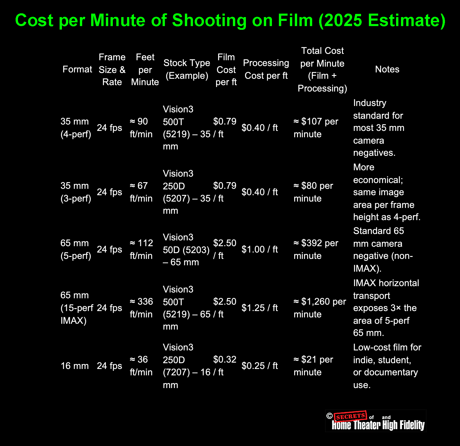
How These Numbers Were Derived

(approximated from Kodak’s data sheets).
2. Film price per foot = total roll cost ÷ roll length.
- 35 mm 1000 ft roll at $791 ≈ $0.79 / ft.
- 65 mm 1000 ft roll at $2,500 ≈ $2.50 / ft.
3. Processing costs (ECN-2 or custom 65 mm labs):
- 35 mm: $0.35 – 0.45 / ft.
- 65 mm: $1.00 – 1.25 / ft (due to special handling).
4. Total = (Feet per minute) × (Film + Processing per foot)
Interpretation
| Format | Total Cost per Screen Minute | Relative Cost (vs 35mm) |
| 16 mm | ~$21 | ~0.2× |
| 35 mm (4-perf) | ~$107 | baseline (1×) |
| 65 mm (5-perf) | ~$392 | ~3.7× | 65 mm IMAX (15-perf) | ~$1,260 | ~12× |
Thus:
● A 90-minute feature in IMAX 65 mm could consume 30,000 ft+ of film at a raw-stock cost exceeding $75,000 – $100,000, before processing and scanning.
● By contrast, the same project on 35 mm might use around 8,000 ft per hour, costing under $10,000 in stock.
There is some confusion about large-format movie film, i.e., 65mm vs 70mm. Super Panavision 70 is actually shot on 65 mm film.
1. The Camera Negative is 65 mm
All large-format theatrical motion pictures, including those branded “70 mm” such as Lawrence of Arabia, 2001: A Space Odyssey, and Oppenheimer, were actually filmed on 65 mm film stock in the camera.
● It contains only the image area, no room for magnetic or optical soundtracks.
● The image frame itself is roughly 48.5 mm × 22 mm for 5-perforation 65 mm film.
So, when you read that Super Panavision 70 or Todd-AO used “70 mm film,” what was meant is that theatrical prints were on 70 mm stock, not that the original negative was.
2. The Release Print is 70 mm
For projection, the finished picture was contact-printed or optically enlarged onto 70 mm release film, which is the same width as the camera negative plus an extra 5 mm.
That extra space accommodates:
● or in modern prints, digital timecode or optical tracks.
So:
Shot on 65 mm (camera negative) → Printed on 70 mm (release print)
That’s why the process is called “65 mm negative / 70 mm print”.
3. Why the Confusion Exists
Film processes and marketing names are often rounded up for simplicity:
● Super Panavision 70 followed that convention; the “70” referred to projection film, not the camera negative.
● The name sounded more impressive and matched the 70 mm projection branding audiences saw in theaters.
So, technically:
Super Panavision 70 = 65 mm negative, 70 mm release print. (The lenses for Super Panavision 70 were spherical, while with Ultra Panavision 70, the lenses were anamorphic.)
4. Modern Equivalent (IMAX and Panavision 65)
● The projected IMAX print is 70 mm wide, again leaving space for sound.
● Panavision’s current large-format cameras (System 65, MSM 9802, etc.) still use 65 mm negatives.
Summary Table
| Stage | Width (mm) | Perforations per Frame | Used For | Includes Sound? |
| Camera Negative | 65 mm | 5-perf (vertical) or 15-perf (Horizontal for IMAX) | Original photography | No |
| Print / Projection | 70 mm | 5-perf or 15-perf | Theatrical release | Yes (sound stripes/data) |
In short:
You shoot on 65 mm film, but you project on 70 mm film. The “extra 5 mm” exists purely for the soundtrack area; that’s why the process is marketed as “70 mm film.”
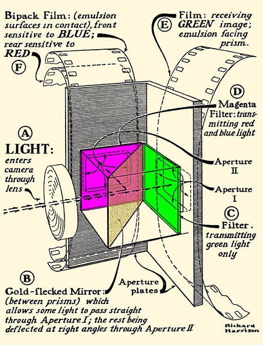
In the classic three-strip Technicolor camera (Process 4), the beam-splitting optical block used red, green, and blue separation, but with an important nuance:
1. The three filters were spectral separation filters:
● Red record: Passed red wavelengths to a second piece of panchromatic film.
● Blue record: Passed blue wavelengths onto the blue-sensitive emulsion of the bipack (the front film).
2. But they were not simple “RGB gels.
The filters were precision dye-gelatin spectral filters matched to Technicolor’s dye-transfer matrices.
They had:
● Carefully shaped passbands.
● Extremely high optical quality.
● Consistency between cameras so that matrices could be standardized.
3. How the three strips were created
The Technicolor beam splitter divided white light like this:
- Blue-sensitive only.
- Recorded scene blue.
- Had a yellow filter backing so that green/red light passed through and was redirected to the rear strips.
- Received green light via a partially silvered mirror.
- Used a precision green filter in front of it.
- Received the remaining red light via a full mirror.
- Used a precision red filter in front of it.
Image © https://www.widescreenmuseum.com/oldcolor/technicolor7.htm
Note that the blue and red sensitive filmstrips were placed emulsion-to-emulusion.
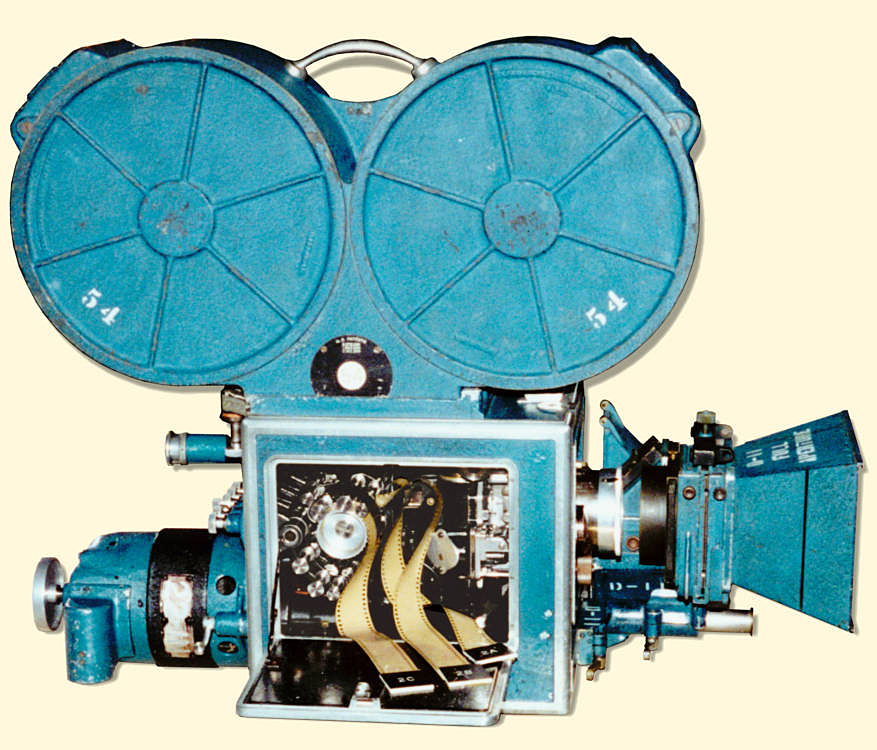
Image © https://www.widescreenmuseum.com/oldcolor/big_camera_pic.htm
Summary
Technicolor used three filters corresponding to red, green, and blue. But they were highly engineered optical filters, not simple theatrical gels, and were positioned inside the optical beam-splitting prism block to spectrally separate the scene into true RGB records for later dye-transfer printing.
Why the Blue Record Filmstrip Was Placed First in the Technicolor Camera
Technicolor’s three-strip camera (introduced in 1932) used a beam-splitter prism to divide incoming light into:
2. Red + Green → reflected 90° into a second optical path containing a green-only filter.
3. Red → passed through the green filter to the red-sensitive strip.
Even though blue photons have more energy, the optical splitting is determined by how the prism discriminates wavelengths, not by photon penetration depth.
Here’s why the blue strip must go first:
1. Blue had to be separated BEFORE filtering because:
Blue dyes and filters are extremely opaque
The Technicolor camera used:
● A green filter for the green/red separation.
● Panchromatic emulsions with varying sensitivities.
Blue light is:
● Easily scattered.
● Strongly attenuated by even thin optical filters.
If the blue layer were placed behind any filter or another film emulsion, too much blue would be lost. So, Technicolor placed the blue-sensitive strip directly in the main optical path, before any major filtering or splitting.
2. Red and green can travel through more optics without major loss
Red and green wavelengths:
● Have longer wavelengths that pass-through filters and beam-splitters with much less attenuation.
● Introduce less scattering and halation in thick emulsions.
Thus, red and green records can be captured after the prism, but blue cannot.
3. The beam-splitter prism naturally separates blue from red+green
The Technicolor splitter used a cemented prism with a cyan (blue-absorbing) dichroic layer.
This layer:
● Reflects green and red sideways.
Because the prism already isolates blue in the first optical path, it is optimal to place the blue-sensitive film there.
Any other arrangement would fight the prism’s spectral properties.
4. Blue Photons having “more energy” is irrelevant here
Although blue photons carry more energy per photon, penetration in gelatin/emulsion isn’t determined by energy alone.
Blue light:
● Is absorbed more strongly by both silver halide crystals and the dyes/filters used.
● Scatters more in bulk materials.
Red light:
● Passes through emulsions with minimal loss.
So, the high energy of blue photons actually makes them less suitable for being placed behind other layers.
Summary
Technicolor placed the blue-sensitive strip first because:
2. The beam-splitter prism isolates blue in the forward optical path.
3. Red/green wavelengths survive multiple filters and optical paths without major loss.
4. “Higher photon energy” does not mean deeper penetration through film or glass.
Thus, the arrangement is optically optimal, even though it seems counterintuitive from energy arguments.
The emulsion-to-emulsion contact between the blue and red filmstrips was sufficient to keep both images in perfect focus.
But the reason why it works is subtle, and it’s one of the most ingenious aspects of the Technicolor three-strip camera design.
Why emulsion-to-emulsion contact preserved focus in Technicolor cameras
1. The blue and red films were positioned at the same optical plane
In the Technicolor camera:
● The red record (after the prism and green filter) was placed behind it, but the two emulsions were arranged back-to-back (emulsion to emulsion).
This means the actual light-sensitive layers of both film strips occupied virtually the same focal plane.
Film stock is structured like this:
(emulsion) ~5–8 μm thick
(base) ~125 μm (clear acetate or nitrate)
(emulsion) ~5–8 μm thick
By putting the emulsions face-to-face, Technicolor eliminated the thickness of the film base from the optical distance.
So, the optical path difference between the blue and red emulsions was only the thickness of:
● A few microns for optical cement.
● The thin blue-balancing filter.
These thicknesses are optically negligible relative to depth-of-focus.
2. Depth-of-focus in the Technicolor camera covered both planes
The Technicolor camera used:
● A very large image area (nearly 35mm frame size per strip).
The depth of focus at the film plane was very generous: typically ±0.002 – 0.004 inch (±50 – 100 microns).
The distance between the blue and red emulsions, once placed emulsion-to-emulsion, was far smaller than this tolerance.
Even if they were misaligned by 10 – 20 microns, the depth of focus still kept the images sharp.
3. The beam-splitter prism maintained perfect path lengths
The prism provided precise equalization:
● The red light path (reflected + filtered)
were engineered so that their optical path length matched within extremely small tolerances.
Optical cement and glass of known refractive indices were selected so that:
2. No image appeared “soft” compared to the other.
3. Registration between the three records was maintained.
The prism geometry was one of the most carefully engineered elements in Technicolor history.
4. Emulsion-to-emulsion was the only workable solution
If the red strip were placed with its base side facing the blue strip, the extra ~125 – 140 μm of acetate would push the emulsion far out of the focus tolerance.
That is why the Technicolor engineers explicitly required:
Emulsion facing emulsion to eliminate film base thickness from the optical distance.
This was formalized in Technicolor U.S. Patent 1,990,471 (1935).
Summary
The Technicolor three-strip system kept both records in perfect focus because:
● The prism equalized optical path lengths.
● Depth-of-focus easily covered any microscopic differences.
● The design avoided introducing the film base thickness into the optical path.
This was a masterful integration of optics and mechanics, and one reason Technicolor photography was so astonishingly sharp.
Technicolor Used TWO Different Beam-Splitter Designs
1. Early Technicolor Camera (1932–1937) – “Process 4 (A).
This is the design shown in the diagram above.
Light path in this earlier camera:
● The bipack (blue and red films emulsion-to-emulsion) was mounted in the side gate.
● Green went straight through the prism in the forward path.
This required:
● A green filter in the straight-through path.
So, the diagram above showing:
● Straight through to Green
is for the early version.
These cameras were used on:
Becky Sharp (1935), A Star is Born (1937), Snow White tests, etc.
2. Later Technicolor Camera (1937–1954) – “Process 4 (B).
This is the design described in the text above.
It became the standard Technicolor three-strip camera.
In the later design:
● Red + Green were reflected sideways.
● A green filter then separated R vs. G on the reflected path.
● The blue strip was placed in the front gate.
● The red strip sat directly behind the blue strip (emulsion-to-emulsion).
● The green strip was placed in the side gate.
This design is the one Technicolor standardized for:
● The Wizard of Oz (1939).
● Fantasia (1940).
● All major Technicolor films through 1954.
Both are historically accurate; they are just different generations.
Film and digital “see” color differently, and this difference remains even after the film is scanned with a digital sensor. It isn’t just about “subtractive vs. additive color” (though that’s part of it). The differences stem from how film creates an image, how digital photography creates an image, and how each reacts to light. These differences are embedded in the film image before scanning, so the digital scan captures them.
Below is the full, technical explanation.
1. Film and digital do not capture color the same way.
Digital cameras measure additive primaries (RGB filters on a sensor).
Film negatives and positives use subtractive dyes (cyan/magenta/yellow).
This alone changes:
● how saturation behaves.
● how highlights roll off.
● which wavelengths are recorded or suppressed.
Subtractive vs. additive really matters
● Digital: red, green, blue collect photons through narrow filters.
The spectral fingerprints of film dyes are very broad, while digital filters are narrow. This gives film its distinctive “rich but gentle” color reproduction and digital its “clean but clinical” look.
2. Film responds to light nonlinearly (digital is linear).
Film has a built-in tone curve called the H&D (Hurter & Driffield) curve:
● Midtones: contrasty.
● Highlights: smooth, graceful roll-off.
Digital sensors are linear until gamma is applied later, so they naturally have:
● very fast highlight clipping.
● no built-in roll-off.
Film’s highlight “glow” and smoothness are inherent to how silver halide crystals saturate. Once this is baked into the negative, scanning cannot remove it.
3. Film has random, organic grain; digital has noise.
Film grain is:
● non-square.
● clumpy and colored differently per layer
● larger in shadows, finer in highlights.
Digital noise is:
● luminance + chroma separated.
● tied to sensor size and readout electronics.
Film grain generates texture, not noise.
4. Film has optical depth; digital is flat.
Each film layer is a physical substance. Light passes through:
2. Blue-sensitive layer
3. Yellow filter layer
4. Green-sensitive layer
5. Red-sensitive layer
6. Base support
7. Sometimes rem-jet or diffusion layers
This creates:
● halation
● depth and separation of colors
● variable focus between layers
● gentle diffusion in bright areas
Digital sensors are 2D surfaces with microlenses; no optical depth.
5. Film captures color with overlapping dye sensitivities.
The three dye layers (C/M/Y) in color negative stock overlap heavily.
This means:
● primaries are less pure
● skin tones roll gently between red and yellow
● greens shift toward cyan or yellow depending on lighting
Digital camera sensors use very narrow color filters, giving:
● more separation between colors
● less natural blending
This is the #1 reason digital skin tones often appear plasticky.
6. Film has halation (red glow around highlights).
Caused by light bouncing inside the film base before reaching the anti-halation layer.
Digital will never do this unless artificially added.
7. Film is exposed differently in each layer.
The three dye layers do not respond equally. For example:
● Green layer is faster (~50–100 ISO)
● Blue layer is very fast (~200 ISO) but filtered to balance it
Digital cameras make RGB exposure uniform; film does not.
This creates the “warm shadows / cool highlights” characteristic of film.
8. Film’s imperfections make it feel human.
Film introduces:
● slight gate weave
● density variation
● analog color crosstalk
● gentle optical diffusion
These imperfections all get digitized during scanning.
Digital footage is too “perfect” unless deliberately degraded.
Bottom Line
A movie shot on film looks different from digital even after scanning because film is a complex, physical, layered, subtractive, nonlinear optical system, while digital is a flat, additive, linear electronic measurement system.
Once the film’s characteristics are formed in the negative, scanning merely records them.
This is why digitally shot movies don’t look like film unless the production applies:
● halation simulation
● grain overlays
● gate weave
● contrast curves
● subtractive color models
And even then, it’s still missing the real physical depth of film.
But, when a movie is shot on film and then scanned for digital distribution, it retains the vast majority of its film characteristics because those traits are physically embedded into the film image before scanning occurs.
A digital scan does not remove the film look; it simply digitizes it.
Here’s the important breakdown.
Why film characteristics survive the digital scan
1. Film’s nonlinear tone curve is already part of the image.
The soft shadows, punchy midtones, and smooth highlight roll-off all come from the film stock’s H&D curve (characteristic curve). Once the negative is exposed and developed, this curve is locked in.
A scanner can’t linearize or undo this; it just records it.
2. Film grain is physical and stays visible.
The grain structure (silver crystals + dye clouds) becomes part of the visual texture.
Scanning records this texture pixel by pixel.
Digital projection doesn’t remove grain; it only shows it at whatever resolution the scan captured it.
3. The subtractive-dye color mixing is preserved.
Film forms color using overlapping cyan, magenta, and yellow dyes.
Digital scans capture the final dye densities, so:
● subtle color crossovers
● the way film desaturates in highlights
● the particular “roundness” of color transitions
all remain intact.
This is why a scanned Kodachrome or Vision3 negative still looks like film.
4. Halation stays.
Halation is the red/orange glow around bright edges caused by light scattering inside the film base.
This is 100% preserved in a scan.
5. Film’s internal diffusion and layer depth carry over.
Color film has:
● filtering layers
● diffusion
● slight inter-layer defocus
These give it an organic depth that digital doesn’t have.
Scanning captures the result of all that optical complexity.
Digital cannot “flatten” film back into a sensor-like image.
6. The characteristic film color palette remains.
Because film has:
● imperfect dye couplers
● non-linear color mixing
…its distinctive color palette stays even after digitization.
This is why movies shot on 35mm still “feel like film” even when streamed on Netflix.
7. Light scatter, gate weave, and lens artifacts carry over.
Anything that happens in-camera (lens halation, gate weave, slight jitter, breathing, dust, scratches) appears on the film negative and therefore appears in the digital scan.
But here’s what does change during digitization
This part matters too:
What scanning eliminates or reduces
● dust and scratches
● bad splice jitter
● color fading (via restoration)
What scanning may introduce
● color grading changes
● compression artifacts (for streaming)
But these are after the fact. They don’t erase the underlying film look.
Bottom line
If it’s shot on film, the “film look” survives the scan almost completely.
Because:
● the color
● the halation
● the contrast
● the dye interactions
● the nonlinear highlight roll off
● the physical imperfections
…are already embedded into the image before the scanner ever sees it.
A digital scan records the final appearance of the film, not a new version of it.
This is why movies shot on film still look like film even when streamed in 4K on an iPad.
Here is the complete, technically accurate explanation, the core reasons why a movie shot on film still looks different from a digital movie with a film-emulation LUT, even though both are ultimately viewed digitally.
This difference is profound, measurable, and impossible to fully “fake,” because film and digital build an image using fundamentally different physical mechanisms.
1. A film-emulation LUT only changes color values, not how the image was formed.
A LUT can:
● adjust saturation
● apply a contrast curve
● imitate some dye behavior
But a LUT cannot simulate:
● how three dye layers each respond differently
● micro-halation
● subpixel grain structure
● optical diffusion within the emulsion
● non-linear exposure response per wavelength
Because all of these things happen inside the film emulsion before the image even exists.
Digital footage has none of that underlying structure, so the LUT is modifying a fundamentally different type of image.
2. Film has optical depth; digital is flat.
Light passes through multiple layers in film:
2. Blue-sensitive layer
3. Yellow filter layer
4. Green-sensitive layer
5. Red-sensitive layer
6. Film base
This produces:
● internal scattering
● glow around highlights
● depth and dimensionality
● subtle color contamination between layers
Digital sensors are two-dimensional photodiodes on a single plane. There is no internal scattering, no layer depth, and no multi-layer interaction.
A LUT cannot simulate a three-dimensional physical structure.
3. Film highlights roll off naturally; digital highlights clip abruptly.
Film’s highlight response is created by:
● dye-layer crossover
● nonlinear shoulder of the H&D curve
This creates:
● “shoulder” compression
● soft glow around bright objects
Digital sensors:
● saturate abruptly
● produce harsh clipping
A LUT can approximate a shoulder curve, but it cannot reintroduce:
● halation
● the organic transition from detailed highlight → saturation → dye rollover
Once a digital highlight is clipped, that information is gone forever.
Film-origin footage rarely clips.
4. Film grain is organic, random, and volumetric; LUT grain overlays aren’t.
Film grain comes from:
● dye clouds
● non-square shapes
● depth-dependent clumping
● wavelength-dependent behavior
● random, non-repeating pattern
Digital grain overlays:
● tile or loop
● don’t react to exposure
● don’t vary by color channel authentically
● don’t push light through a physical medium
True film grain moves and breathes with the image because it’s part of the negative structure.
A digital overlay just sits on top.
5. Film captures color subtractively; digital captures color additively.
This is the biggest scientific difference.
Film dyes = subtractive color
● magenta absorbs green
● yellow absorbs blue
● dye curves overlap heavily
Digital sensors = additive color
● filters are much narrower
● color mixing is linear and math-only
This causes:
| Feature | Film | Digital (even with LUT) |
| Skin tones | creamy, warm, gently shifting | cleaner, more clinical |
| Greens | cyan/teal bias | pure, sometimes neon |
| Highlights | desaturate organically | desaturate suddenly or clip | Reds | deep dye-driven density | electronic red gain curves |
A LUT cannot undo the fact that the RGB channels from a digital sensor began life as additive spectral samples rather than dye absorptions.
6. Film resolves edges differently.
Film:
● produces halation
● mixes colors at boundaries
● exhibits lens breathing and tiny weave
Digital:
● crisp, abrupt transitions
A LUT cannot introduce true optical softness because the softness must occur before the image is recorded.
7. Film responds differently per layer to different ISOs.
Each layer of color negative film has a different effective speed:
● green layer: moderate
● red layer: slow
This produces:
● color separation under mixed lighting
● nonlinear color crossover
Digital sensors are:
● uniform spectral response
● without multi-speed layers
A LUT can tint shadows, but it cannot replicate the layer-dependent exposure physics.
8. Film has imperfections that become invisible “character”.
Film-origin footage contains:
● gate jitter
● microscopic breathing
● halation rings
● density variations
● minor lab timing shifts
These defects create what the brain interprets as texture with soul.
Digital plus LUT is too perfect underneath.
9. Digital color grading overrides LUTs.
After applying a LUT, the colorist:
● adjusts primaries
● sharpens
● denoises
These actions dilute the film-emulation LUT’s effect. Film-origin images have their look before any grading happens.
10. Human perception recognizes “real vs simulated”.
Even if a film-emulation LUT is excellent, the human brain notices:
● how light blooms
● how grain behaves
● how highlights clip
● how skin tones roll
● how motion feels
Film’s look is produced physically, organically, and stochastically. Emulation is an after-the-fact mathematical approximation.
The eye can tell.
Final Summary
Film-origin movies preserve the physical fingerprint of film: grain, halation, nonlinear highlights, subtractive color mixing, and depth.
Digital-origin movies with LUTs are still fundamentally digital: perfect edges, clipped highlights, narrow RGB sampling, and 2D pixel noise.
Both end up as digital files. But the origin of the image determines the soul of the image.
Film is a physical, layered, light-sensitive material. Digital is a grid of sensors. That difference cannot be eliminated by software.
Now you know why some directors shoot on film even though the final distribution to theaters and home streaming is digital (except for special showings on film at selected theaters).
However, shooting a movie on 35mm film typically adds between $300,000 and $2 million to the production budget of a mid- to large-scale feature compared with digital.
For very low-budget films, the added cost is proportionally higher; for blockbuster films, it’s proportionally smaller.
But to understand the costs accurately, you have to separate:
● Film stock and processing (massively more expensive)
● Scanning/DIT workflow differences
● Crew workflow differences
● Time-related costs
Below is a clean, professional breakdown used in production budgeting.
1. Camera rental costs
Digital cameras are actually more expensive to rent than film cameras.
| Gear | Typical Weekly Rental |
| ARRI Alexa 35 / Mini LF | $5,000–$10,000 per week |
| Sony Venice 2 | $3,000–$6,000 per week |
| RED V-Raptor XL | $2,500–$5,000 per week |
| ARRI 435 / 535 / Arricam ST or LT (35mm) | $1,200–$3,000 per week |
| Panavision XL (35mm) | Often $0* (Panavision subsidizes film) |
*Panavision frequently provides 35mm camera bodies at very discounted or even no base rental to support filmmakers using film.
Bottom line:
Camera rental is cheaper for film.
But these savings are tiny compared to the cost of the film stock itself.
2. Film stock and processing (the big cost)
This is where shooting film becomes expensive.
Film stock cost (2025 prices)
● 400’ = ~4 minutes at 24 fps
● Cost per minute: $45 – $55
A typical feature uses 300,000 – 1,000,000 feet of film, depending on the shooting ratio.
Processing (developing)
→ $60 – $85 per 400’ roll
Scanning (to digital)
● High-end HDR 6K/8K archival scans (Lasergraphics, ARRISCAN): $0.50–$1.00 per foot
Combined real-world cost of film stock + processing + scanning
| Film Footage Used | Total Added Cost |
| 200,000 ft (10:1 indie ratio) | ~$150k – $300k |
| 400,000 ft (20:1 low-budget studio) | ~$300k – $600k |
| 800,000 ft (40:1 typical big studio feature) | ~$700k – $1.2M |
| 1,200,000 ft (action/blockbuster) | ~$1.2M – $2M |
This is the primary reason digital is cheaper.
3. Digital workflow is cheaper
Digital workflow includes:
● SSDs / media rental
● Duplication / LTO archiving
But compared to film:
● No processing lab
● No scanning
● No chemical waste
● Much lower cost per minute shot
Even with expensive camera rentals, digital still wins by a wide margin.
4. Time is money; film slows down production slightly
Film shooting:
● checking the gate
● shorter takes
● rehearsing before rolling
● resetting for film mags more often
The time difference is usually:
If your crew + actors + locations cost $100k/day, even a 5% slowdown = $5k/day, which adds up over a multi-week shoot.
Digital allows:
● immediate playback
● faster resets
But some directors (Nolan, PTA, Tarantino) consider the discipline of film actually saves time.
5. Real-world estimates from major productions
Example budgets (publicly known estimates):
● La La Land (shot on 35mm): added ~$1M
● Mission: Impossible – Fallout: ~40% shot on film, film added ~$900k – 1.3M
● Indie films (5–10:1 ratios): added ~$100k – 250k
Digital equivalents of these films would have saved almost all of that.
SUMMARY: How much more expensive is shooting on film?
Film camera rental
→ slightly cheaper
(-$30k to -$200k vs digital)
Film stock + processing + scanning
→ very expensive
(+$300k to +$2M)
Workflow time differences
→ slight increase
(+$20k to +$200k)
TOTAL NET DIFFERENCE
Shooting 35mm film adds roughly $300,000 to $2,000,000 to a typical movie budget compared with shooting digital.
Do audiences really care if the movie is shot on film, or is it just a director’s preference?
Most audiences don’t consciously care or even notice whether a movie was shot on film or digital, but they do respond subconsciously to the differences.
Long answer (the real answer): Whether the choice matters depends on the type of audience and the goals of the filmmaker.
Below is the authoritative breakdown from cinematography research, industry surveys, and case studies.
1. MAINSTREAM AUDIENCES → Don’t notice, don’t care
For the average moviegoer:
● They assume everything is digital anyway.
● They care more about story, acting, and spectacle.
● They cannot identify film vs digital in blind comparisons.
Conclusion:
For 90% of the general audience, the capture medium does not matter consciously.
2. EDUCATED MOVIEGOERS → Often feel the difference, don’t name it
People who love movies but aren’t trained in cinematography often say things like:
● “It has a texture.”
● “It looks classic.”
● “It feels more real.”
● “Digital feels too clean/sharp/plastic.”
They don’t say “oh, this must be Kodak Vision3 5219,” but they respond to the aesthetic.
3. CINEMA PURISTS / FILM STUDENTS → They notice
For cinephiles:
● Halation
● Color separation
● Highlight roll-off
● Gate weave
● Film stock characteristics
…are recognizable and meaningful.
These viewers often care a great deal, even if they represent a small portion of ticket buyers.
4. DIRECTORS, CINEMATOGRAPHERS → It matters a lot
This is where the biggest preference exists.
Why? Because film offers:
● Texture and dimensionality
● A familiar workflow
● Proven archival permanence
● Discipline on set
● A particular emotional response
● Historical continuity with cinema history
Some directors will only shoot film (Nolan, Tarantino, Paul Thomas Anderson). Some prefer digital for flexibility and cost (Fincher, Cameron).
For the filmmaker, the choice affects every decision on set. The audience sees the result, but filmmakers experience the process.
5. Psychological effect on actors (very real)
Actors often report:
● They rehearse more.
● They stay focused.
● They don’t “waste takes.
Film brings pressure and intentionality, which many directors like. Digital makes it easier to roll endlessly, which some directors dislike.
The audience doesn’t know this… but they often feel tighter performances.
6. Enthusiast audiences can tell, subconsciously.
Viewers may say:
● “This looks dreamy.”
● “This looks nostalgic.”
● “This looks hyper-real.”
They’re responding to:
● color dye interactions
● halation
● micro-contrast
● nonlinear highlight roll-off
Even if they don’t know how to articulate it.
7. Aesthetic trends show that film does influence audience perception.
Look at examples:
● Dunkirk / Oppenheimer (65mm), many viewers said it felt “epic” even if they didn’t know why.
● Star Wars sequels (shot on film), fans noticed it “looked like the originals.”
● Joker (35mm), praised for its “late-70s vibe.”
● Marvel films (digital), often described as too clean, too sharp, or “soap-opera-like.”
Audiences respond emotionally, even unknowingly.
8. Blind tests show mixed results.
When shown two versions:
● But 80 – 90% say they prefer the “film look” even when they can’t identify it
This suggests a subconscious preference, not a knowledgeable one.
9. Streaming compression makes the differences smaller.
When watched on:
● Amazon
● YouTube
● iPhone
● Cheap TV
…the film look is softened by:
● sharpening
● noise reduction
● crushed shadows
But the “feel” often remains. Even a heavily compressed scan of film still looks very different from digital with LUTs.
FINAL ANSWER
Do audiences care?
Consciously:
→ Most do not care and cannot tell.
Subconsciously:
→ Many respond positively to film’s aesthetic qualities.
Cinephiles and filmmakers:
→ Yes — deeply.
So, the decision is usually driven by:
2. Cinematographer preference
3. Aesthetic goals of the film
4. Budget
But the audience does feel the difference, even if they don’t know why.


