Staff
![]()
Background
RCA is one of the larger consumer electronics companies, and they were also a supporter of the DIVX format. After using this player, we wonder if DIVX failed because it was a bad idea or if it was because of the poor picture quality their players delivered.
Anyway, here are our test results:
Video
The overall video quality of this DVD player is very poor. When you have the player set to 16x9, with all 4:3 and non-anamorphic DVDs, black bars are inserted on the sides of the image. This Window boxes movies on 16x9 displays. We could not find any way to defeat this feature, so it really ruined the 16x9 experience.
This player only offers YC and composite outputs.
Black and White Levels
| Format | Black | White | Comments |
| YC | 7.0 | 97.1 | Black is 0.5 IRE low, which is OK. White is low by about 2.9 IRE. |
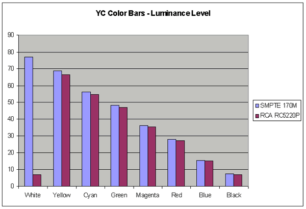
Color Bars
YC
While we measured the white level at 97.1 IRE, the Y portion of the YC output shows a strange thing with regards to white. White is VERY low. The rest of the Y output is just below SMPTE 170M
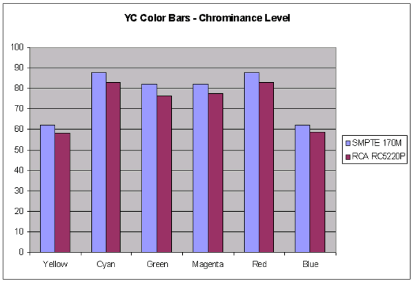
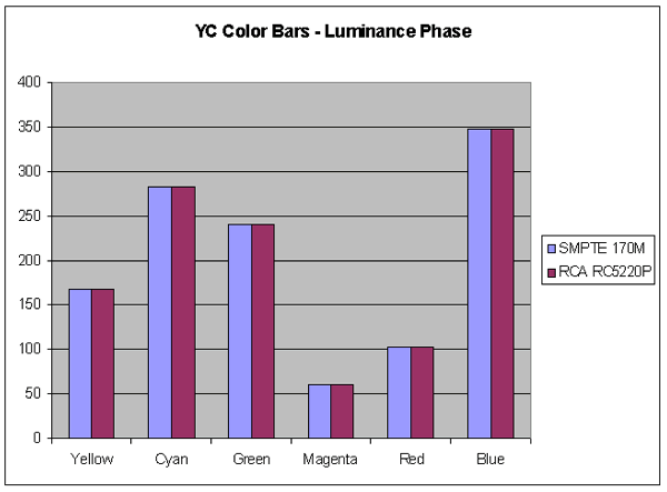
The chroma level of the YC output is a bit lower than SMPTE 170M. The Chroma phase is perfect.
Composite/YC Data
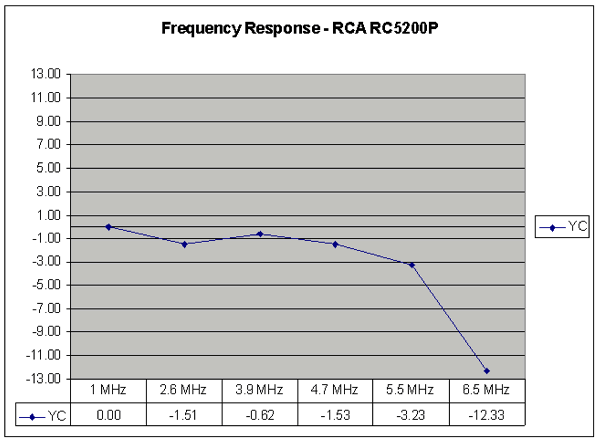
Video Frequency Response
Where do we begin? This player is doing something nasty to the video signal.
Not only is the response poor, but the Tektronix VM700 is telling us that the multi burst packets are different than what they
are supposed to be.
The VM700 thinks the 5 MHz packet is 6.5 MHz. So, we read what the VM700
told us.
The player is down –1.51 dB at 2.6 MHz. It goes back up at 3.9 MHz, but then drops back down at 4.7 MHz.
At 5.5 MHz it is down –3.23 dB, and at 6.5 MHz it is down –12.33 dB.
This player stinks, as in "Where is the nearest garbage can?" When
we mentioned in the introduction that there were two bad players, this is one of them.
Video Frequency Response
Pixel Cropping
| Location | Pixels | Comments |
| Top | 0 | Excellent |
| Bottom | 4 | Good |
| Left | 0 | Excellent |
| Right | 1 | Excellent |
Signal-To-Noise Ratio
| Format | Output | SNR (dB) | Comments |
| YC | C-AM | -51.9 | Very Poor - This player is tied with the DV-09 for worst SNR on the YC output. |
| YC | C-PM | -59.4 | Poor |
Audio
Audio Frequency Response
For a modern electronic audio component, the frequency response on this unit was terrible. Using 1 kHz as a reference, there's a wide hump in the mid-bass, a gradual roll-off in the bass, and a very uneven treble. It's difficult to say if it's worse or slightly better than the Apex, but neither can be considered even mediocre. Although the direct audible effects of such a relatively uneven frequency response will be slight, compared to speakers, it indicates poor parts, poor engineering, or both.
Audio Frequency Response

Harmonic Distortion + Noise FFT
It's hard to tell whether the distortion products are high, because where it looks like the spectrum would be in the lower order side based on where the higher order spectrum seems to be going, the noise floor covers everything. However, one can see substantial amounts of higher order distortion in proportion to whatever there could be at lower frequencies lurking under the noise. All in all, not so good. Anyone located that dumpster yet?
Distortion Spectrum

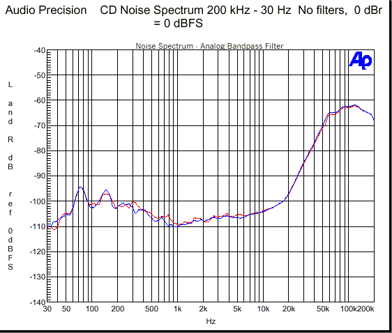
Wide-Band noise spectrum FFT (Wall AC)
The noise floor straight out of the wall was a bit on the high side at lower frequencies, but not extraordinarily so within the audible range. We did find it a bit disturbing that above 20 kHz, the noise floor started to shoot up off the graph before it hit the 80 kHz limit of the FFT.
Noise Floor (Wall)
.gif)
Wide-Band noise spectrum FFT (Lab grade AC)
Using a regenerated AC supply didn't seem to make one bit of difference, indicating that the noise floor was not the result of poor line filtering by the power supply, but just inherent to the unit, and that ultrasonic ramp up off the chart was just as undaunted.
Noise Floor (Lab)
.gif)
Wide-Band noise spectrum FFT (Sweep to 200 kHz)
In order to get a full picture of what was happening, we resorted to doing a sweep, and adjusted the measurement scale to account for higher amplitudes which one wouldn't normally expect from electronics these days. What the sweep revealed, although with less resolution, was a large amount of RF centered at roughly 100 kHz, at about –62 dB. This isn't, obviously, directly audible, but may cause audible problems if that noise, un-attenuated, got into a power amplifier with bandwidth out to 100 kHz, and a poor phase margin. Keep in mind that a well-designed amplifier, even with a very wide bandwidth, would just pass the noise on through. However, some amplifiers, which abuse negative feedback to achieve their bandwidth, sacrifice phase response at their high limit, and can be prone to oscillate with content at those frequencies, and can introduce audible problems because of it. A few of those amplifiers have even been designated by some of the audiophile press as “Class A” components, meaning performing as the best available. Makes you wonder if they had clean underwear when they were writing their reviews. Oh well, that is why the average IQ is only 100.
Noise Floor (Sweep 200 kHz)
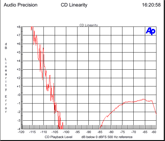
Low-Level DAC Linearity
Now, this graph makes the low-level DAC linearity looks just a bit worse than it actually is. We had a bit of trouble synching the CD player with the Audio Precision, so that you can see that where the output is relatively linear in reference to the –60 dB tone, it's already -0.8 dB down. Still, though, adjusting for that, the DACs only remain with ± 1 dB of linearity down to –78 dB. Really bad. In our database of results, this thing might end up as a bookend for the low extreme.
DAC Linearity
Dynamic Range
93 dB. A bit short of linear 16-bit resolution.
Inter-Modulation Distortion
-114.5 dB. Probably its best performance parameter.
Functionality
Avia
|
|
| Overlaid Text Problems |
Click on the images above to see a close-up of what the error looks like.
Note: A green check in the boxes below means that feature worked OK. A red X means it is unsatisfactory.
| Test | Results | Comments |
| Subpicture |
|
When in 16x9 mode, some menus have text overlaid on top of each other. Appears to be caused by auto black bars on the side. I guess some menus are not 16x9. |
| Slide Show |
|
Video Essentials
| Test | Results | Comments |
| Blacker-Than-Black |
|
|
| Stress Test |
|
WHQL
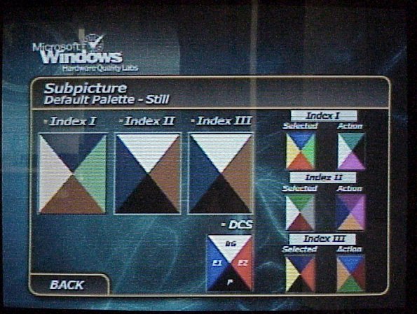
Subpicture Palette (DCS)
|
|
 |
 |
| What it should look like | Palette Problems | Text Problems |
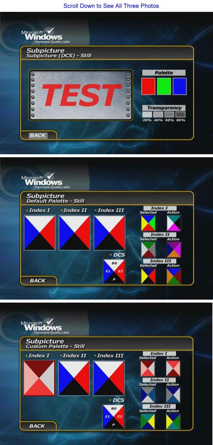
Click on the images above to see a close-up of what the errors look like.
| Test | Results | Comments |
| Still |
|
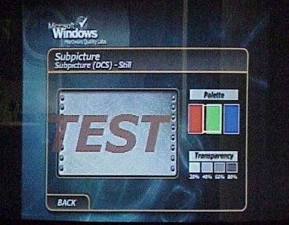
Red is brown; green and blue are a different shade of each. If the player is set to 16x9 mode, then it is all screwed up. The text "TEST" extends beyond its normal background. |
| Bob |
|
Red is brown; green and blue are a different shade of each. If the player is set to 16x9 mode, then it is all screwed up. The text "TEST" extends beyond its normal background. |
| Weave |
|
Red is brown; green and blue are a different shade of each. If the player is set to 16x9 mode, then it is all screwed up. The text "TEST" extends beyond its normal background. |
Default Palette Color Index
| Test | Results | Comments |
| Still |
|
Red is brown; green and blue are a different shade of each. If the player is set to 16x9 mode, then it is all screwed up. |
| Bob |
|
Red is brown; green and blue are a different shade of each. If the player is set to 16x9 mode, then it is all screwed up. |
| Weave |
|
Red is brown; green and blue are a different shade of each. If the player is set to 16x9 mode, then it is all screwed up. |
Custom Palette Color Index
| Test | Results | Comments |
| Still |
|
Red is brown; green and blue are a different shade of each. If the player is set to 16x9 mode, then it is all screwed up. |
| Bob |
|
Red is brown; green and blue are a different shade of each. If the player is set to 16x9 mode, then it is all screwed up. |
| Weave |
|
Red is brown; green and blue are a different shade of each. If the player is set to 16x9 mode, then it is all screwed up. One advantage of this player having so many problems here is that we could just cut the text and paste it over and over again in these boxes. |
Branching
| Test | Results | Comments |
| Seamless Branching |
|
This player is better than required; it is able to branch in one clock sweep. |
| Multiple Angles |
|
It takes between 0.5 and 1 second to change angles. |
Menu
| Test | Results | Comments |
| Loops |
|
|
| Ends |
|
Field/Frame Freeze
| Test | Results | Comments |
| Weave |
|
|
| Bob |
|
16x9 Menu
| Test | Results | Comments |
| Letterbox |
|
|
| Widescreen |
|
Cropping
| Test | Results | Comments |
| 352x240 |
|
Squished with excessive flicker. |
| 720x480 |
|
|
| 704x480 | ||
| 352x480 |
Layer Break
It takes between .5 and 1 second to change layers.
| Test (DVD) | Results | Comments |
| "Cruel Intentions" |
|
|
| "Ghostbusters" |
|
Excessive flicker on shadows. |
| "Friends" VCD | ||
| "Saving Private Ryan" (DTS) | ||
| "The Abyss" | ||
| Chesky Super Audio 96/24 |
Physical Response
| Test | Results | Comments |
| Setup |
|
|
| Transcode |
|
|
| CD-R |
Error Correction/Concealment
Pierre Vareny
This player is near the bottom. It is able to read up to and including chapter 30, which represents a 0.75mm gap.
Scratch the Dog
The menu comes up distorted. It is non-functional.
Usability
The Remote Score = 6 out of 11. The image gives you an indication how the RCA designers have considered the usability of the remote.
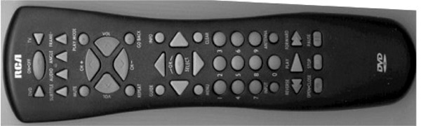
We established our rating scheme in the usability article with the Eleven Tenets of Remote Design. Each one of those principles gets the player 1 point, so the maximum possible score would be 11. See the comments for each of those design tenets.
| Test | Results | Comments |
| Button Access |
|
The transport controls (Play, RW, FF, etc) are really separated from the arrow keys. The number pad is placed in between them for some unknown reason. The number pad is more closely associated with the channel and volume controls for the TV at the top of the remote. |
| Minimal number of buttons |
|
The remote exposes too many buttons and could have benefited from the sliding panel used by the Toshiba remotes. Other remotes have mapped the arrow keys to channel and volume controls, which saves space and doesn't overload the buttons. The remote is also missing the chapter next and previous buttons. |
| Distinctive buttons | RCA made each of the buttons unique and easily distinguished by feel. | |
| Appropriately sized buttons | The buttons do not communicate their priority by size. Remote makers need to make decisions about what people are going to be doing with their remotes. | |
|
Good tactile feedback |
The buttons have a high profile and provide good feedback when they are pressed. | |
|
Fits well in a single hand |
The remote body is slender and can be easily grasped in one hand. | |
| Right/Left Handed | The remote is symmetrical and is easily used in either hand. | |
| Backlighting | With so many buttons, this remote could have really benefited from backlighting. This isn't such a bad thing given the unique shapes of the remote buttons. | |
|
Indication of control mode |
Since there are two sets of controls, one for the TV and one for the arrow keys, users aren't likely to confuse the two modes. | |
|
Standard naming |
There aren't any strangely named buttons on the remote. | |
|
Player feedback |
The Bottom Line on Usability
The remote faired better than either the video or audio quality.
- Staff -
| DVD Benchmark Explanatory Articles | |||
| Part 3 - Functionality | Part 4 - Usability | Part 5 - Progressive Scan |
Return to Table of Contents for this Issue.
Magazine Publishing Solutions by