
As with any technology, especially an emerging one, a lot of things can get screwed up, but we are going to focus on some major design issues relating to how HDR displays should handle and reproduce highlights delivered by an absolute EOTF signal.
Recall we said a 10% pattern size is used for test patterns when calibrating both Dolby Vision and HDR10. What’s the big deal? Why is that 10% pattern size so significant? After all, with a hypothetical ideal display it wouldn’t make any difference what window size we measure, the luminance should be the same. Sadly, we live in the real world where that is not the case. Consider for a moment the following luminance performance of a certain HDR display as a function of how much of the screen is lit up:

At a glance it should be obvious this is a display capable of a 1,000 nit output (just a shade over to be exact). Yet that nice juicy output is available only over, at most, a 10% area of the screen. If we ask it for maximum output over a progressively larger area, its ability to spit out light drops. By the time we cover the entire screen with white, the max luminance is “just” 170 nits. A few of you may be recoiling right now, wondering what “loser” HDR TV this is…
It is the Sony BVM-300 reference monitor, on which the majority of existing HDR content has been graded. And it is no loser. It is a beautiful, high performance piece of equipment. Those 170 nits over 100% area luminance is plenty. We’ve repeated it several times already and we’re going to do it again: the majority of HDR footage, as a function of screen area, should not be much brighter than SDR. HDR and its insane luminance allowance is for highlights, not for turning your TV into a tanning bed light. It’s worth noting that the Sony is an RGB OLED which in part explains why it tops out at 1,000 nits. The RGB added together cannot produce the same white as the RGBW OLED from LG. OLED technology certainly has room to grow.
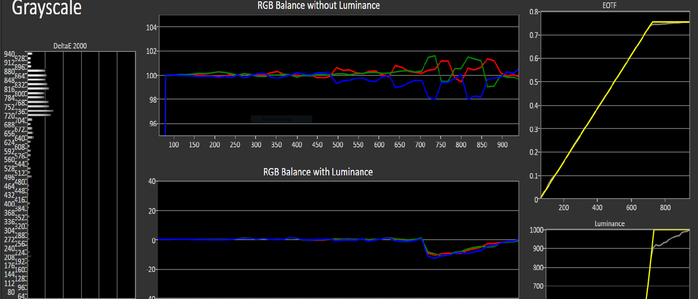
Back to calibration, it should be fairly obvious now why a 10% pattern size is critical: it is the only way to obtain and measure the peak luminance of a well-engineered HDR display.
This is a bit of a head trip I know, so we’re going to dwell on it for just a moment. This graph and its measurements have nothing to do with EOTF response. The BVM-300’s response is not aberrant; it is simply power limited. The net result here is that anything graded on this monitor (which, again, is most of the HDR material to date), will never contain data which is beyond its “power response” (at least none which is meant to be seen).
In consequence this does set a precedent for how our displays at home should behave: they need to operate like the reference monitor if we want to claim accurate reproduction. Content graded on the reference monitor may contain small, very bright highlights yet will never have excessively bright full-screen scenes. This makes it pretty much pointless for anyone to engineer consumer displays which can push their max luminance over a larger area. Better to spend the money on making peaks brighter, not larger. In other words, as an example, it is preferable to have a display capable of 1,000 nits over 10% of the raster than one which can spit out 500 nits over 100% of it.
In fact, in ITU-R BT.2100-0 (Image parameter values for high dynamic range television for use in production and international programme exchange), they make a special note that their current max luminance recommendation for a display of >= 1,000 nits “…is not to imply this brightness must be achieved for full screen white, rather for small area highlights”.
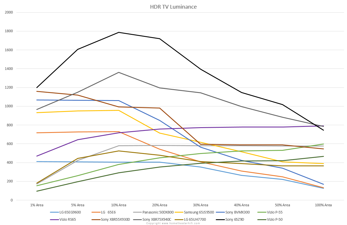
Why are we harping on this? So glad you asked. Consider now this same graph with the addition of a broad sampling of consumer HDR displays sold in 2015 and 2016.

All the models graphed in blue follow the behavior of the reference monitor. This is good. It means that other issues notwithstanding they can be correctly calibrated using a 10% pattern size. Because their power response emulates the reference, they should be capable of producing an accurate image in the luminance domain. A couple models fall off slightly as we go towards the 1% area but it is a small enough drop that we decided to lump them into this category.
The models graphed in yellow are still ok in terms of calibration in that they max out on the 10% pattern size… however their output falls off in both directions. This is very interesting because unlike a fall-off to the right, the fall-off to the left is not a power limitation. Rather, this is a deficient panel design, a poor dimming algorithm, or a combination thereof. Bottom line is they are going to have an aberrant response on material with small but bright elements, content which is supposed to be one of the many hallmarks of HDR (a scene with sparks flying from a welder, neon signs at night, fireworks, use your imagination).
The models graphed in red exhibit a rather odd behavior: when a small area of the screen is energized, they produce their worst output, yet as the picture occupies more and more of the screen their luminance actually increases. This is categorically a bad panel design. With real world material the result is going to be an aberrant luminance response from scene to scene and even within a scene. Depending on how “bad” their output is with the 10% pattern size relative to 100%, we might not even be able to calibrate them using the standard pattern size. Anything we do is going to be a compromise at best. This is bad enough such that we are going to dwell on it for just a sec.
Let us take a pragmatic look at the “best” one from the red group against the reference:

At first glance it looks like the display graphed in red is capable of 800 nits. Yet it will only achieve that output if the entire screen is pure maximum white. This will NEVER happen with real world material. Even with the esoteric example of a movie scene fading to pure white, such will never be at a level exceeding 170 nits (assuming said content is graded on the Sony). This means that the area shaded in grey is “wasted” performance: content will never ask for it. Conversely though, the movie may well contain more concentrated areas of bright highlights and as one can see at a glance, the smaller the area, the farther below reference is the output of the red model.
It is most important to note that these graphs show what the displays put out when “asked” for maximum output, ostensibly 10,000 nits, at these various area sizes. If we ask the display graphed in red above for 700 nits over a 10% sized area, the graph would suggest it can do that, but if we redo these sweeps with a 700 nit signal level instead of 10,000, the entire plot line drops down!
The more forward thinking among you will note that comparing displays against today’s reference is short-sighted: tomorrow’s HDR content may well be graded on the Pulsar to 4,000 nits (and beyond). Indeed such content will “tilt” the reference line, with a much higher peak on the left hand side of the graph, but it will always fall off to the right. The point is that even if future content does contain full-white scenes in excess of 800 nits (unlikely), that changes precious little in terms of our regard for this particular display: no amount of tone mapping can hide the fact that this unit is incapable of small area highlights.
Consider the following test pattern/window:

That’s a 10% window size. Not as small as you imagined, is it? “But” you say, “movies aren’t made up of test patterns”. Consider then this real-world image with a very similar content composition:

The end of the tunnel is just about 10% of the screen area (shown by the grey box) and is supposed to be nice and bright, imparting a sense of daylight beyond. Let us suppose for artistic intent its peaks hit a couple thousand nits or so. On any given HDR display today this should come out at whatever the display’s native maximum is. Yet on any of the models we graphed in red, it will be notably under maximum.
Another example:

This is from that same HDR footage we looked at earlier, graded to 4,000 nits. The flame of the furnace flickers a bit but averages right around 10-bit code value 836, or 3,300 nits (in other words, very bright!). On one of the displays we graphed in red, the flame comes out at less than half the peak luminance the display is capable of when it should have come out at or close to its native maximum.
If we focus on even smaller localized content, such as the molten steel on the anvil, or the sparks, these panels do even worse and all the models graphed in yellow join them. The hammer strike is supposed to be roughly the same brightness as the furnace flame, but on the majority of displays in our roundup will actually be dimmer, an example of how the relative brightness of a scene’s elements can be undermined by a poor design.
Another real world example, this one from Netflix’s Marco Polo (available in Dolby Vision):

Image Copyright Netflix.
I could keep going with these all day long.
By now you are probably dying to know which HDR displays are in our roundup. Click here for a version which includes labels.
All of the models graphed in red are VIZIO FALD LCD models we’ve tested or have obtained data on. All exhibit the “inverted power response” behavior (and we have every reason to extrapolate that the couple we haven’t measured follow suit).
If you haven’t already, go back and take another look at my Dolby Vision calibration of the VIZIO P50. I hope the gears are turning in your head right now and the proverbial lightbulb of thought is turning on.
When we asked it to give us its best, to go as bright as it can over a small area…it is actually at its worst! What I haven’t told you yet is that I had to “cheat” in order to calibrate it: its output with a 10% pattern size is so low it couldn’t even come close to reaching its own Golden Reference target of just 400 nits (which if we are being honest is not all that impressive to begin with). With a 1% size window its output is below the SDR standard! I actually had to use a 35% window size just to get enough light out of it to calibrate it. It is impossible for the current VIZIOs to produce a categorically accurate HDR picture. Don’t get me wrong, the picture isn’t “bad” and cooked up high APL images look impressive, but make no mistake: it is not correct.
The yellow lines are from a pretty mixed bag ranging from the otherwise excellent, but it this one aspect tragically hamstrung, Sony FALD models to the edge-lit Panasonic and LG. All will struggle with isolated highlights, but at least can be calibrated with the standard 10% window patterns.
The blue lines, not surprisingly, come from mostly OLEDs (which includes the Sony reference monitor itself) though we do see an FALD and even an Edge-lit LCD. Please note this is not an endorsement of any of these models. It is vital that we point out our measurements “only” go down to a 1% pattern size. That’s still a fairly large chunk of screen, much larger than many potential small details in an HD or UHD image.
Moreover, as we pointed out a few thousand words ago, all of the edge-lit models with their precious few stripe-shaped zones, regardless of how they measure in this aspect, are in practice more like overly bright SDR screens than true HDR ones. They may measure bright, but they are incapable of producing real world HDR content with the requisite localized contrast.
This is all very interesting because while we expect OLED, from a technology point of view, to produce the best response in this respect (as exemplified by the OLED Sony reference monitor) and indeed it does, we traditionally expect LCD to be severely challenged (Dolby Pulsar notwithstanding), yet there is some hope for FALD LCD.
We’ve just been through a lot of material so we’ll let you take a break and digest it. It is our hope that at this juncture you have a good understanding of what HDR is (and is not), that HDR10 is really a subset cut from Dolby Vision, and that just because a TV is marketed as “HDR” does not necessarily, in our view, qualify it as such.
In the next installment we will tender the Secrets HDR Benchmark. This will be an appendix to our existing video Benchmark products focusing exclusively on the HDR aspects and metrics of display devices, UHD Blu-ray players, etc. Stay tuned.
Brian Florian
I would like to thank Stacey Spears and Tyler Pruitt for their assistance in the preparation of this article.
Images in this article are copyright their respective owners and/or sources.
Part 1: High Dynamic Range (HDR): Fundamental Concepts of Dynamic Range
Part 2: High Dynamic Range (HDR): Dolby Vision and HDR10
Part 3: High Dynamic Range (HDR): An Explanation of Resolution and Color
Part 4: High Dynamic Range (HDR): SDR Calibration